NOW ARRIVINGPersonal Branding
Gate
Personal brand design
Flight Path
Bright, Organic, Thoughtful
Flight No.
2025
For my personal brand, I wanted to create something bold and bright, yet grounded and memorable. I’ve always been drawn to organic shapes and natural movement because of the rhythm and balance that show up in the world around me. My identity combines those elements with expressive color and minimal, thoughtful typography to create a system that feels both intentional and alive. The goal was to design a brand that reflects who I am as a designer: Curious, balanced, and full of heart.
I chose CS Castle and Quasimoda to reflect the duality in my design style: expressive yet intentional. CS Castle adds warmth and elegance, while Quasimoda’s clean geometry keeps everything grounded and modern—bright, organic, and always thoughtful.
Type Choice
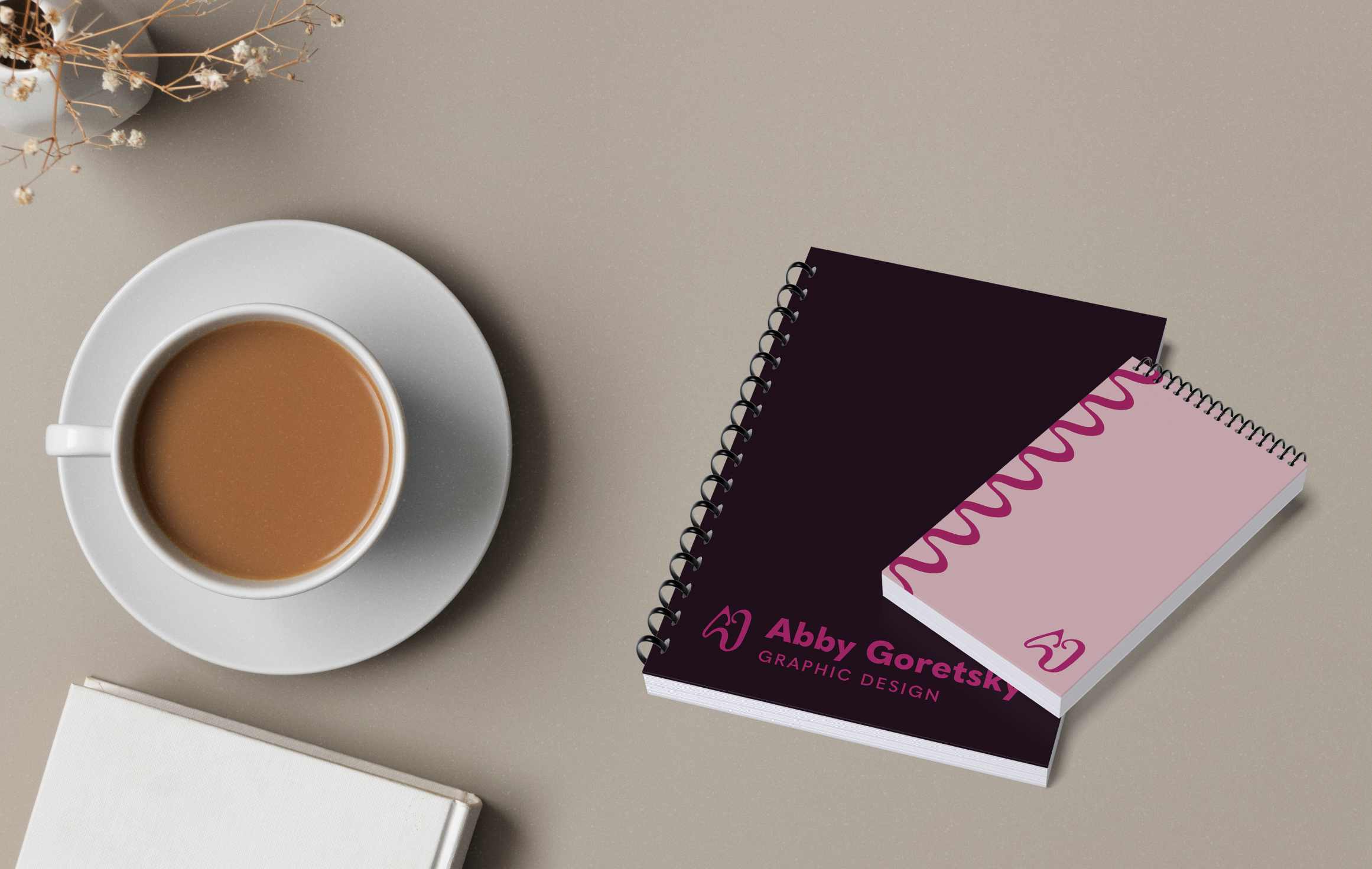
My color palette is inviting and expressive, reflecting how I design. Soft blush and cream bring warmth, layered blues add clarity and balance, and deep plum adds richness. My bright signature pink signals creativity, confidence, and joy. Together, the palette stays true to my brand: bright, organic, and thoughtful.
Color Choice
When developing my personal logo, I explored countless directions through nearly a hundred sketches, moving from organic to geometric to abstract.
Concepts & Sketches
I narrowed my concepts to two logo directions and began refining them. I explored type and name placement to see how each could expand into a full visual identity.
Digital Drafts
I landed on a monogram I loved, but the “G” needed clarity. I went back to the drawing board, refining the letterforms to keep the design organic, meaningful, and legible.
Altering the “G”
With the “G” finalized, I subtly refined the “A” to match. The result is a balanced, cohesive logo that keeps its organic movement.
Perfecting the Details
Once the monogram clicked, everything else followed. From there, it was about pulling the pieces together and shaping a brand that truly feels like me.
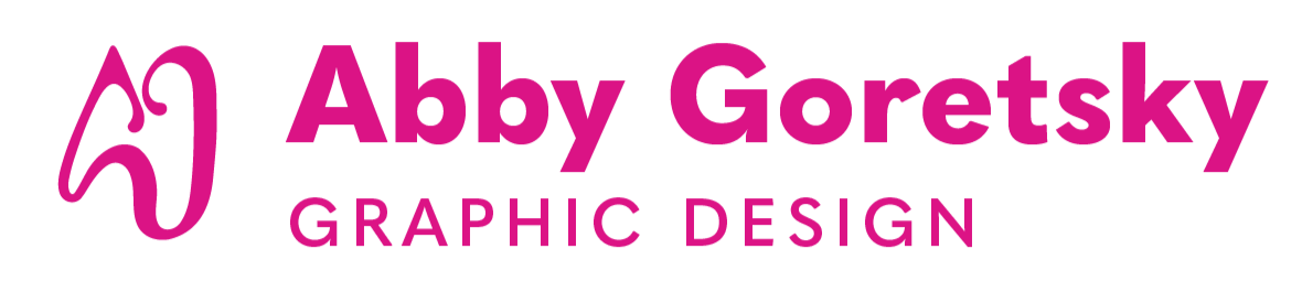
The Final
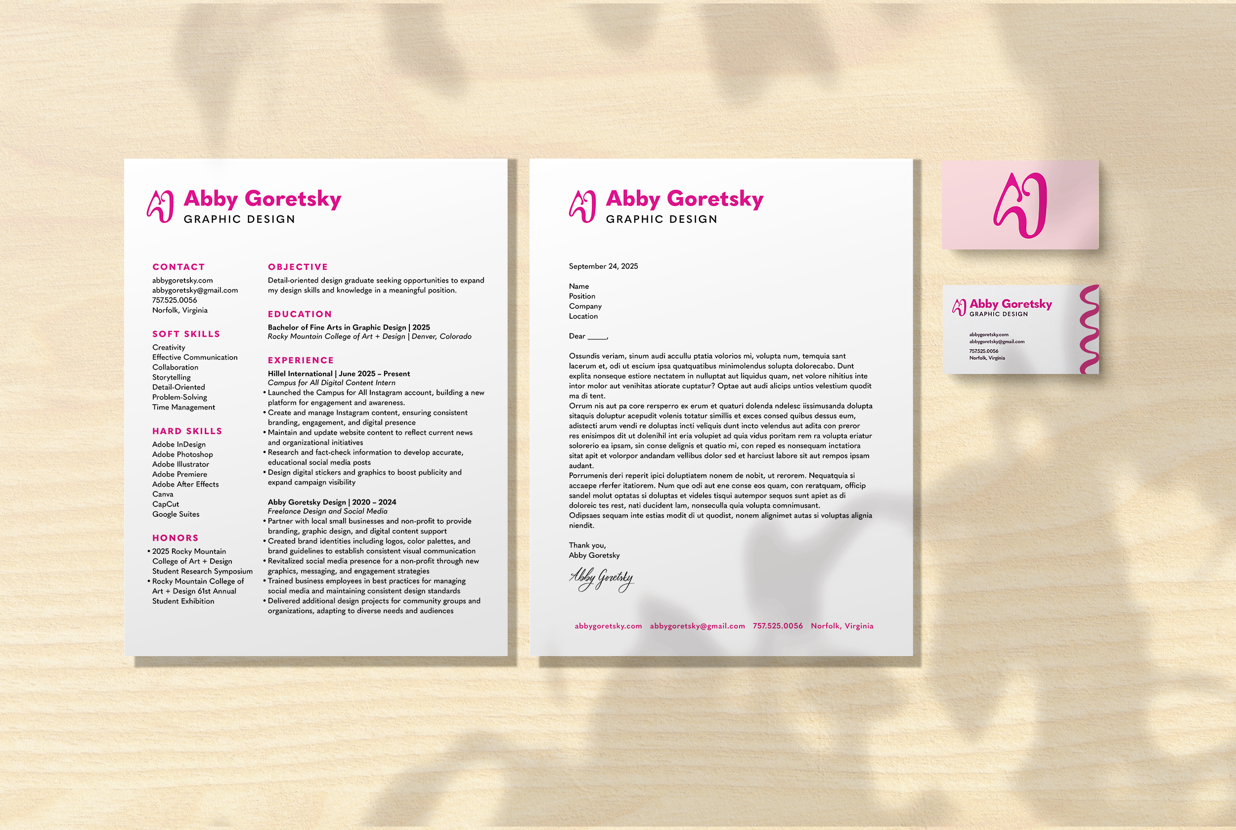
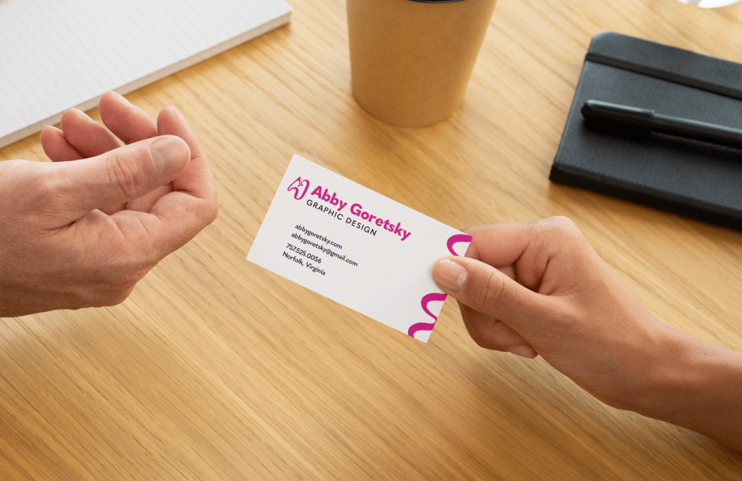
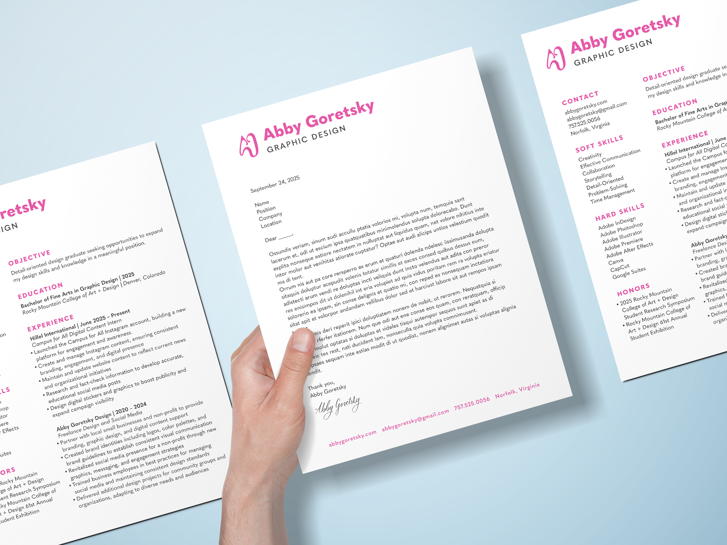
These lockups explore different layout variations of my personal branding, showing how my logo flexes across assets while maintaining a cohesive identity.
Lockups
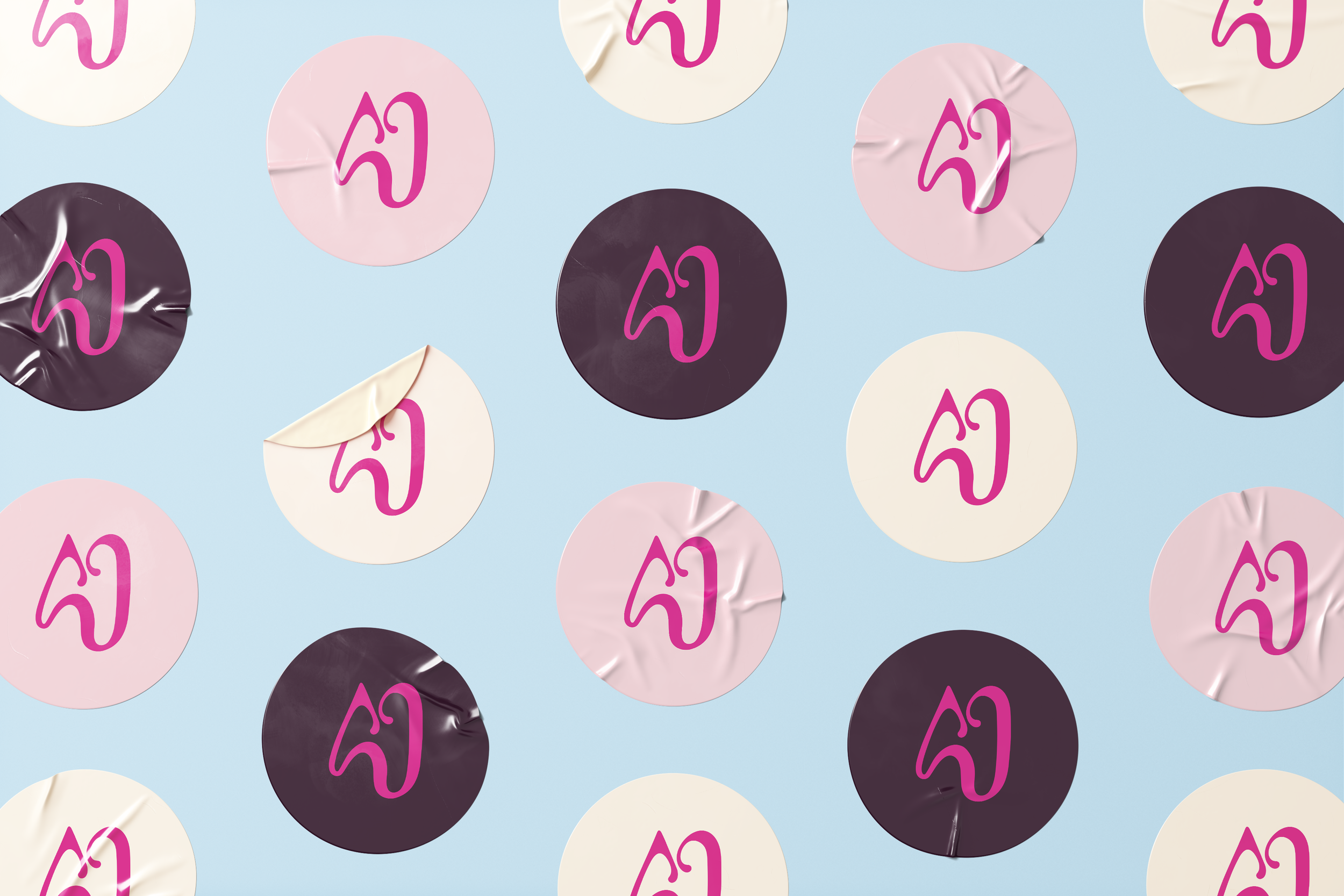
This animated logo brings my brand to life. Motion adds energy, strengthens recognition, and creates a memorable first impression.
Animation
I believe I achieved that intent by building a brand that feels unmistakably me. Every choice, from the color palette to the typography, reflects my process and personality. The result is a system that’s not just visually consistent, but emotionally authentic. It’s something that grows with me and represents how I approach design: with purpose, playfulness, and heart.
Intent