NOW ARRIVINGThe Ever After
Gate
Service-Based Brand + Catalog
Flight Path
Elegant, Romantic, Modern
Flight No.
2022, 2025
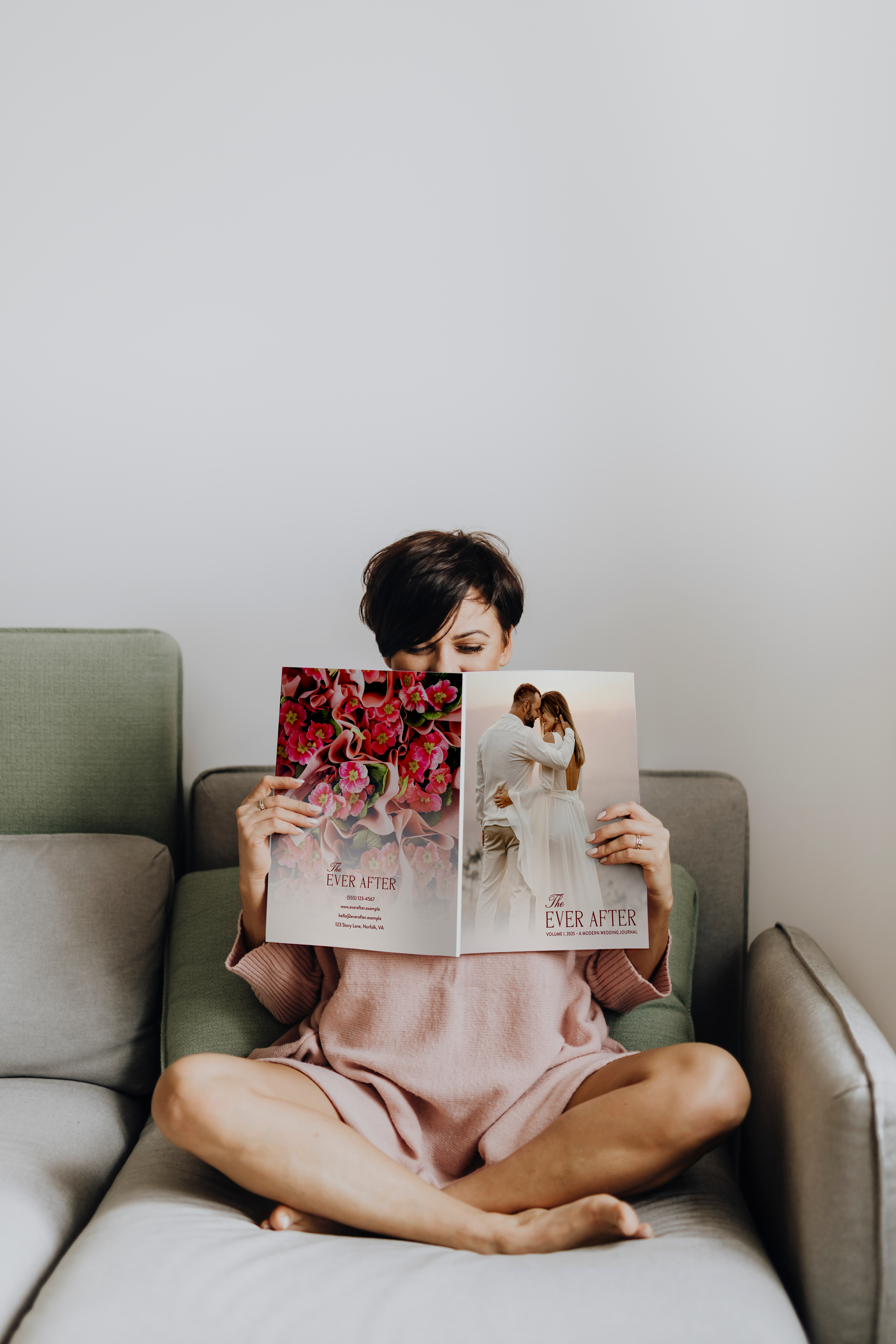
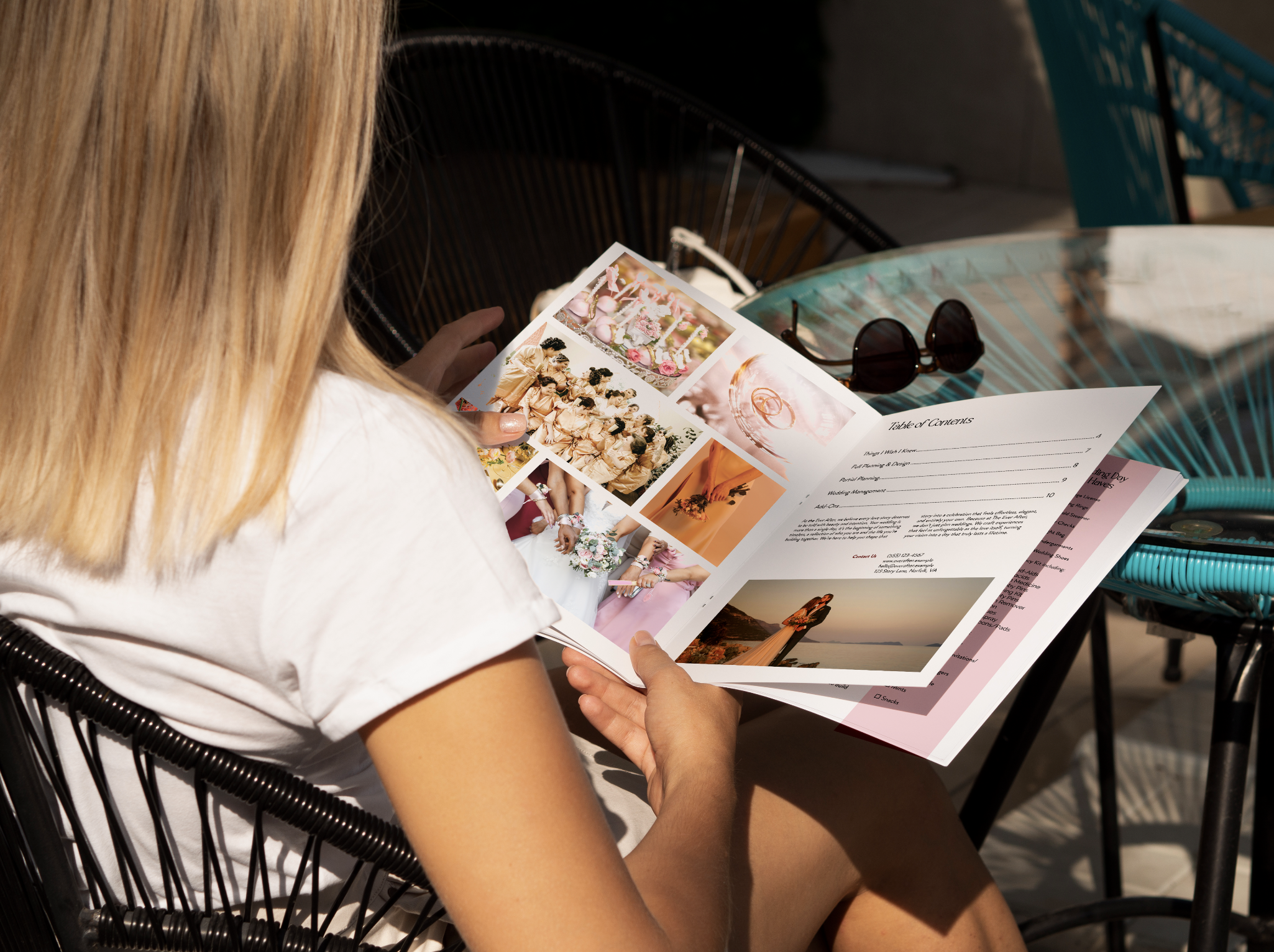
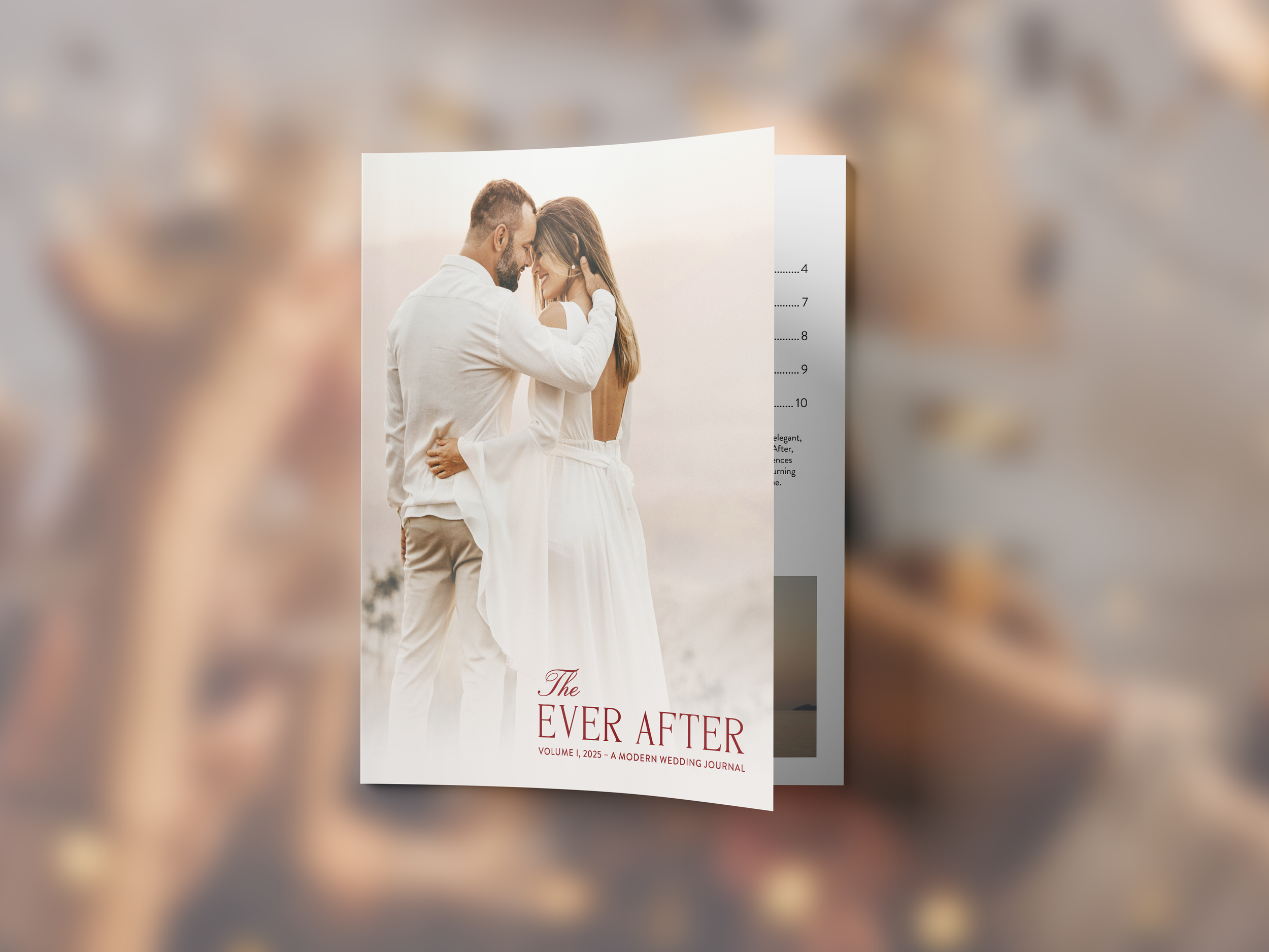
Ever After is a modern luxury wedding-planning brand created to capture the beauty, emotion, and individuality of every love story. The brand blends timeless romance with contemporary design through soft typography, refined color palettes, and elegant layouts. Every element was crafted to feel intentional and sophisticated while maintaining a sense of warmth and joy. My goal was to design a brand that feels both elevated and approachable, one that celebrates love in a way that’s modern, personal, and unforgettable.
I chose Magoa and Brandon Grotesque to balance romance and modernity for Ever After. Magoa brings soft, timeless elegance, while Brandon Grotesque adds clean structure, creating a system that feels refined, romantic, and approachable.
Type Choice
The Ever After palette balances romance with refinement. Deep burgundy and red bring warmth and passion, while soft blush and ivory add airiness and elegance. An unexpected emerald green introduces a fresh, modern contrast, creating a palette that feels emotional, elevated, and effortless.
Color Choice

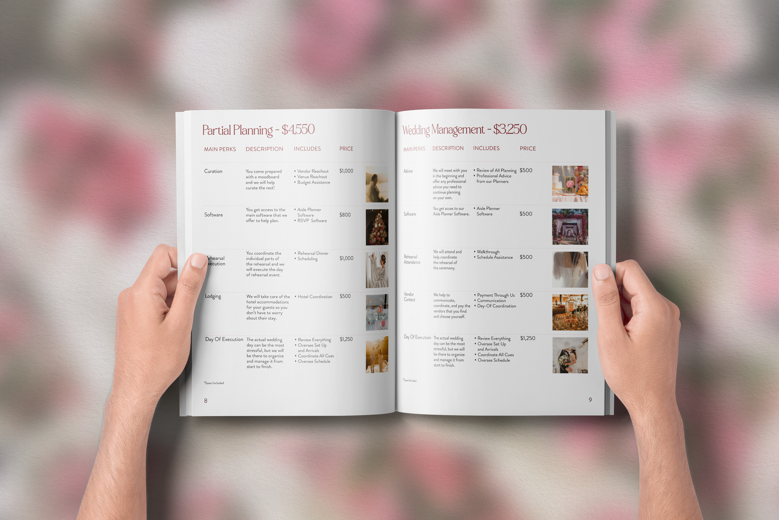
Ever After began as Vows & Veils, a project created to challenge myself while learning InDesign. I designed a service catalog using the table tool, blending my interest in weddings with layout-focused design. The result was a 12-page catalog that stayed true to the original vision while streamlining the tables into a single, cohesive system.
Concepts + Wireframes
This project began as Vows & Veils, an early piece in my design journey. While the layout was strong, the branding needed refinement. Revisiting it with more experience, I reimagined the project while preserving what originally made it special.
The rebrand became a full transformation—everything but the layout evolved. Renamed The Ever After, the project embraced a more modern, romantic vision. I refreshed the palette by pairing soft pinks with deeper reds for contrast and reworked the photography with warm pink, orange, and gold tones, creating a cohesive, inviting story that finally brought the brand to life.
First Try vs. Take Two
First Iteration
Second Iteration
I believe I achieved my intent by creating a system that balances modern simplicity with romantic detail. The typography, color, and layout work together to tell a story that feels elegant but not distant, thoughtful, but never cold. The Ever After reflects what I love most about design: crafting experiences that connect emotion, beauty, and meaning in a way that feels effortless.
Intent