NOW ARRIVINGOlea Essence
Gate
Brand Redesign
Flight Path
Sustainable, Organic, Timeless
Flight No.
2025
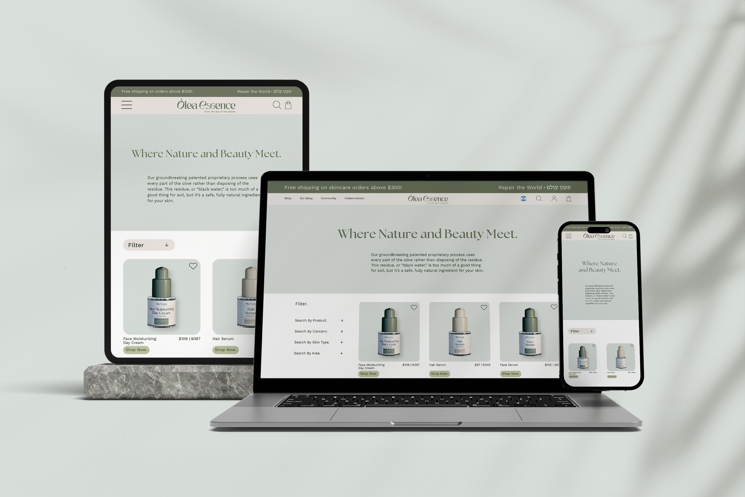
Olea Essence is a sustainable skincare and olive oil brand that I’ve long admired for its commitment to natural beauty and eco-conscious practices. For this project, I reimagined the brand to reflect the quality and authenticity of its products while giving it a more elevated, cohesive visual presence. The new identity blends organic textures, modern typography, and a grounded color palette to capture both nature’s elegance and the brand’s mission. My goal was to enhance an already meaningful brand, keeping its heart intact while refining its voice and visual impact.
I chose The Seasons, Work Sans, and Henri to balance elegance, clarity, and cultural authenticity for Olea Essence. The Seasons adds organic refinement, Work Sans keeps the system clean and modern, and Henri grounds the design in Hebrew typography that honors the brand’s Israeli roots.
Type Choice
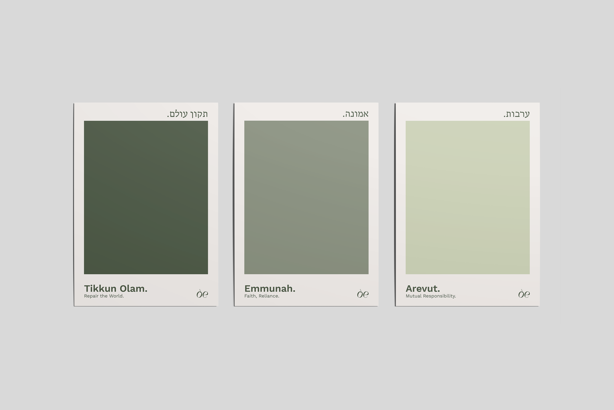
The Olea Essence palette draws from nature through rich olives, soft neutrals, and warm organic tones. Deep green grounds the brand, while olive hues bring balance and calm. Warm neutrals and a pale blue-gray add softness and airiness, creating a palette that feels fresh, natural, and refined.
Color Choice
For the Olea Essence logo, I aimed for simplicity with a sense of luxury. The design feels timeless and authentic, capturing the brand’s natural elegance and artisanal warmth at first glance.
Logo Sketches
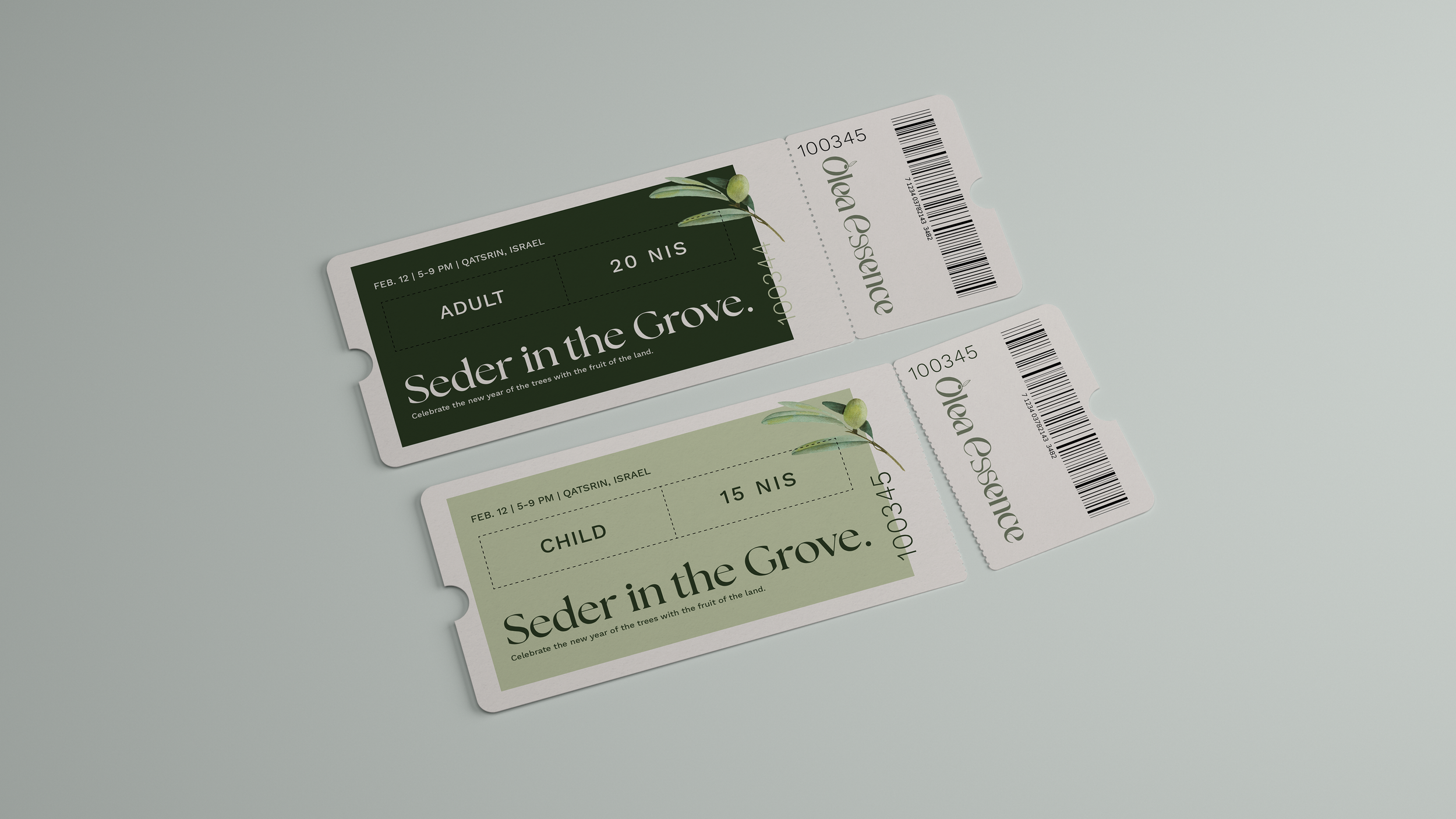
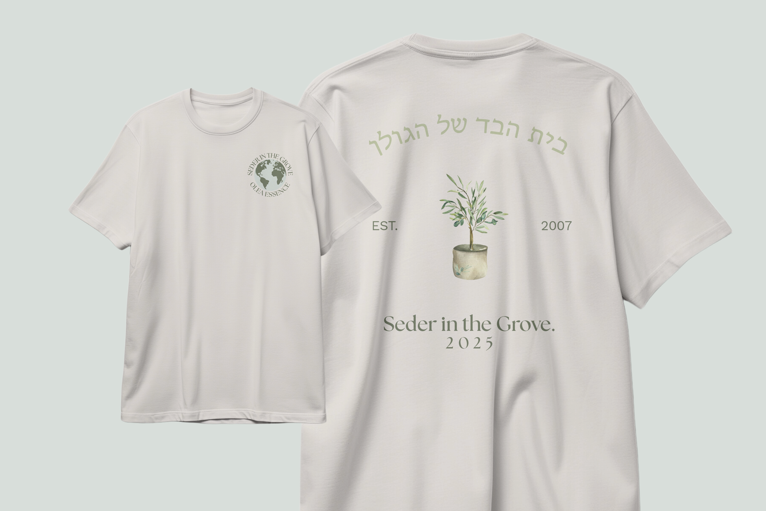
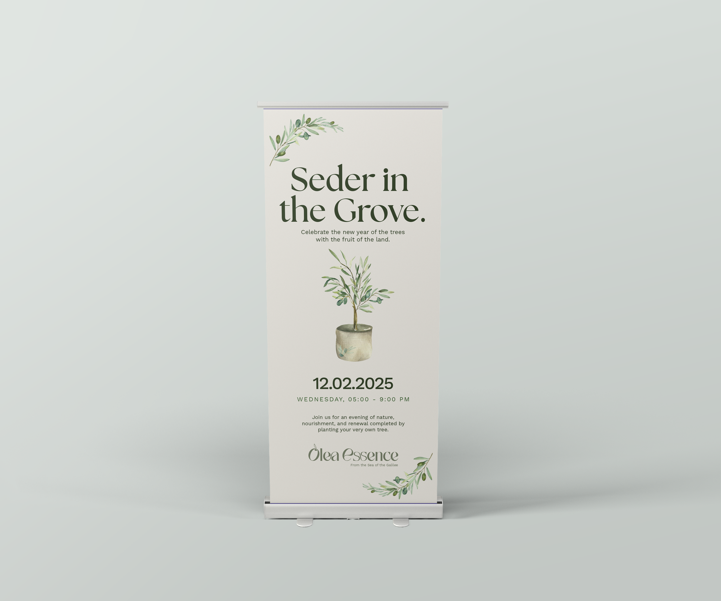
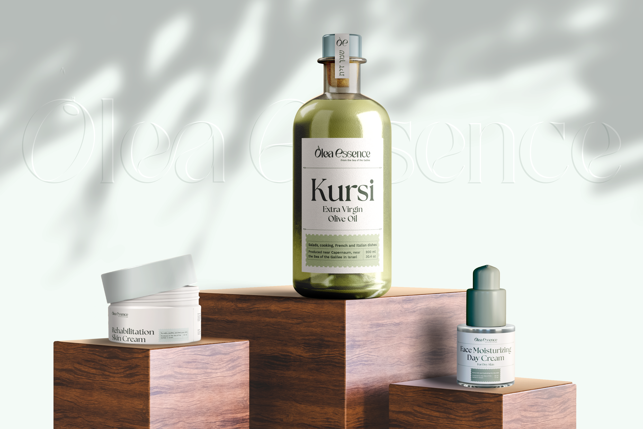
Before moving forward, I finalized the product labels as the foundation of the Olea Essence brand. Designed for use across packaging, ads, and digital spaces, the labels are consistent, timeless, and accessible across languages—honest, organic, and intentionally simple.
Label Sketches
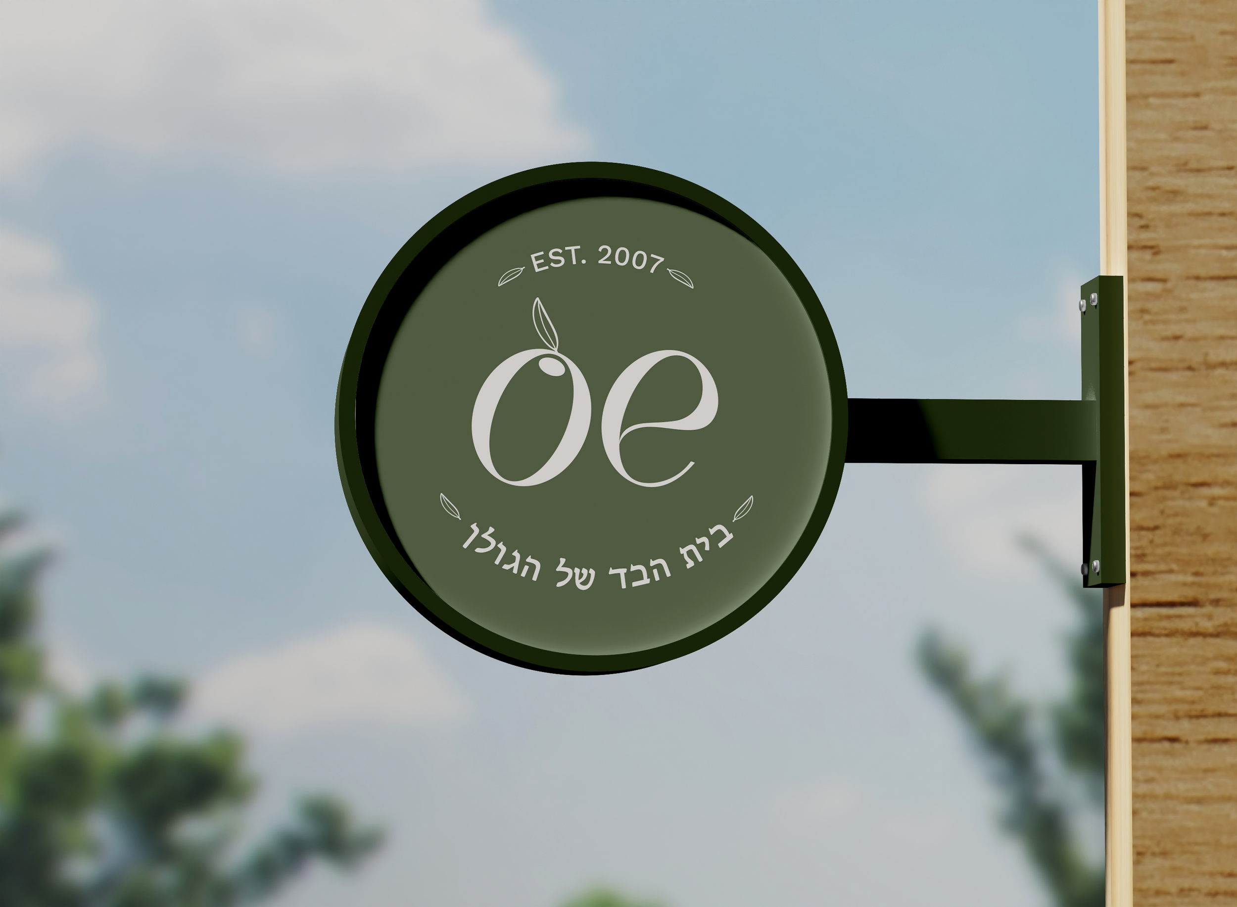
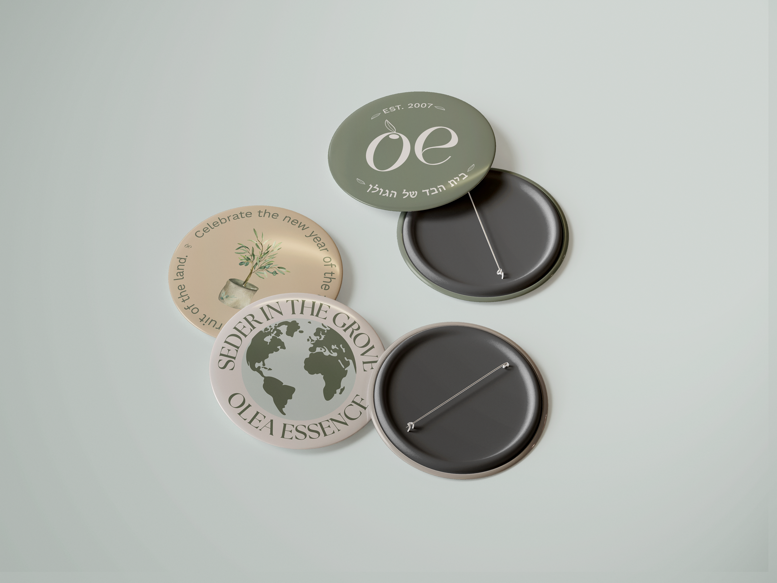
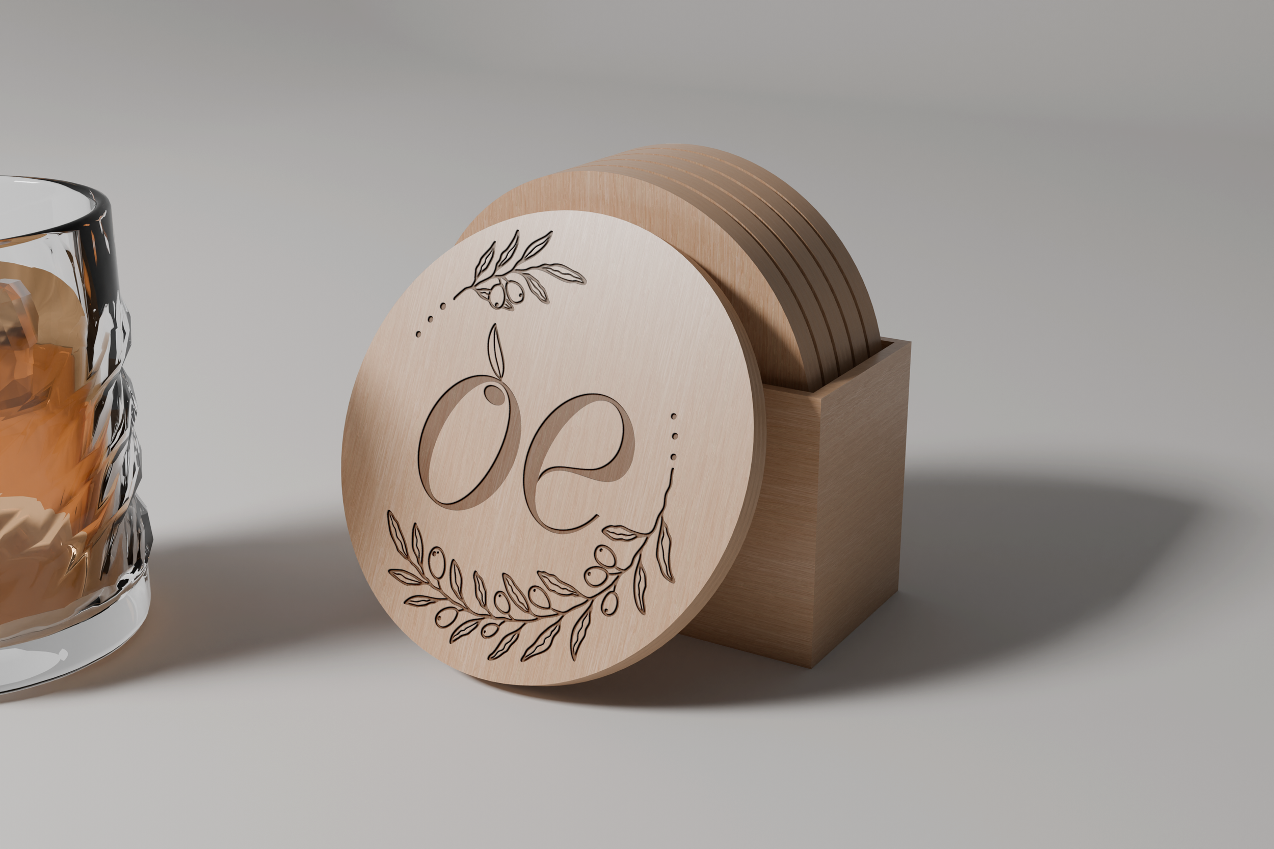
For Olea Essence, I designed an elegant wordmark that evolved into a flexible monogram. The logo feels organic, refined, and approachable—capturing the essence of the brand (pun absolutely intended).
Final Logo
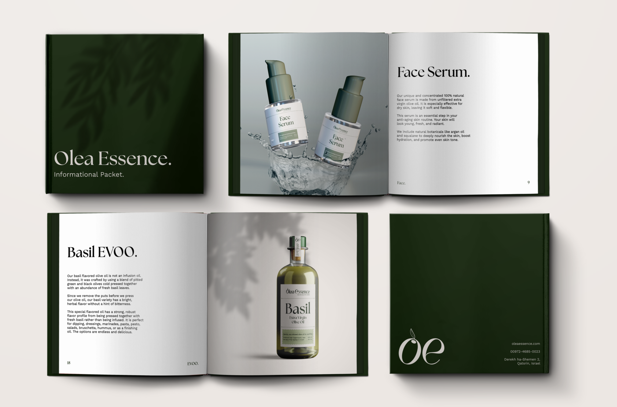
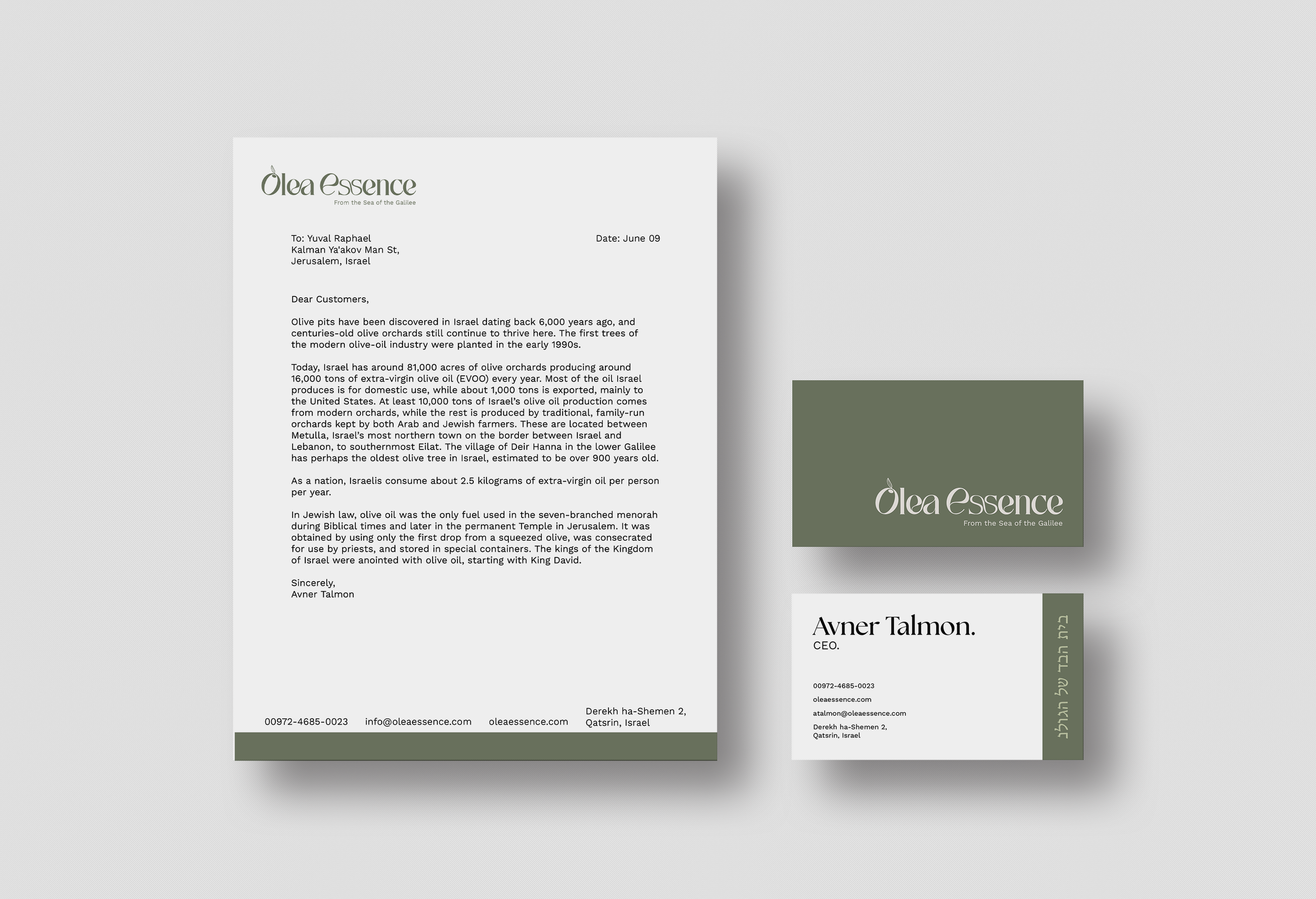
The Olea Essence informational packet supports the brand while celebrating its products. Designed to mirror the brand guidelines, it highlights each item with the same care, refinement, and cohesion.
Get Informed
I believe I achieved my intent by designing a system that feels sophisticated yet deeply connected to the brand’s roots. Through careful attention to color, texture, and typography, I elevated Olea Essence’s identity without losing its natural warmth. The result is a refreshed brand that feels modern, ethical, cultural, and timeless, one that continues to honor the beauty of nature while strengthening its connection to today’s conscious consumer.
Intent