Restaurant Marketing
Project Type
Brand Identity
Keywords
Cultural, Experiential, Expressive
Year
2022, 2025
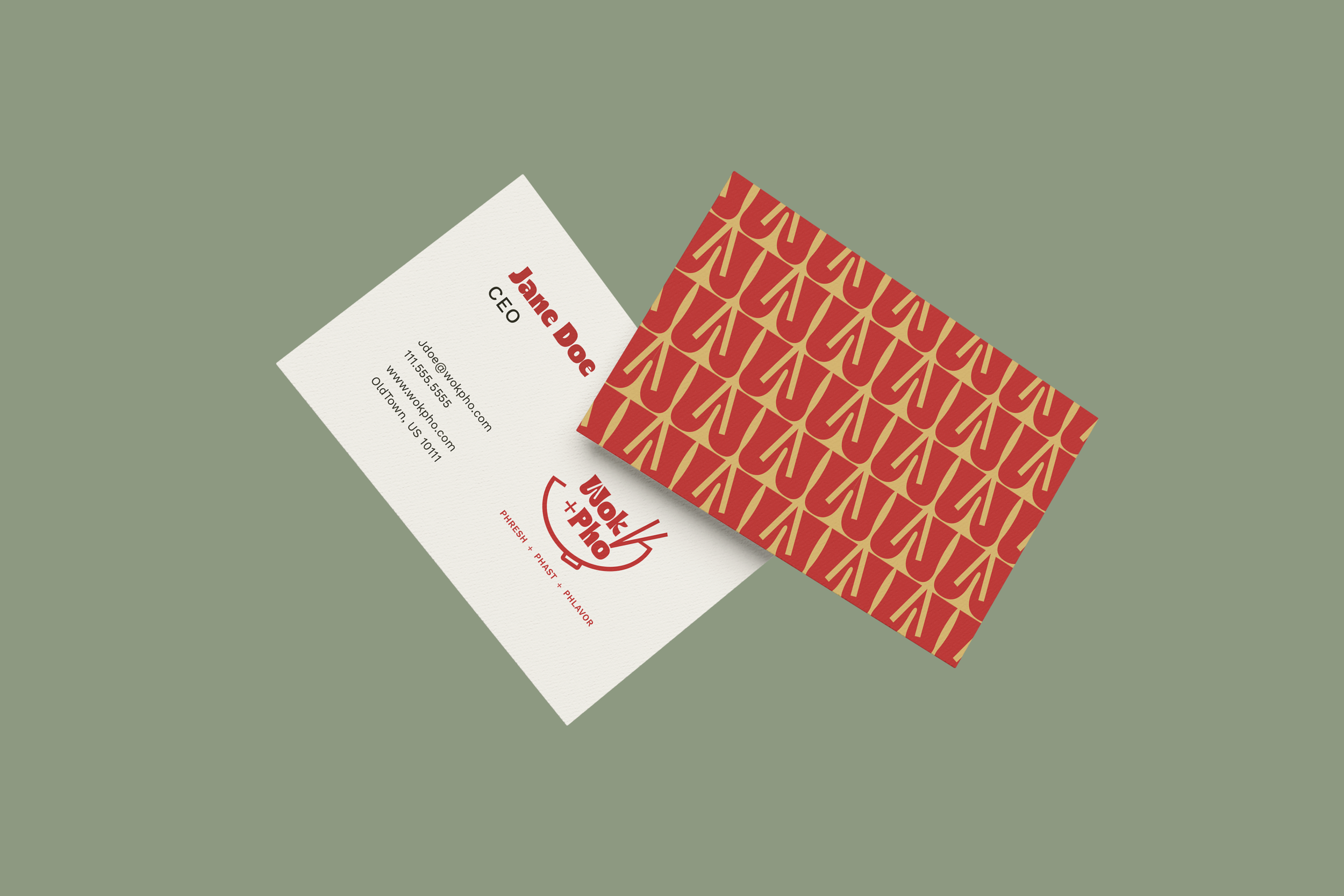
Wok + Pho
Food and design share one thing in common: They both tell stories. This series brings that idea to life through three unique restaurant brands – Yolk’d, Wok + Pho, and Sababa. Each one captures a distinct cultural flavor and mood, from the playful energy of brunch with friends to the comforting warmth of a home-cooked meal. Together, they show how thoughtful design can make you feel something before you even take a bite.
Wok + Pho is a modern Vietnamese fusion restaurant concept that blends tradition with a contemporary dining experience. I wanted to create a visual identity that feels inviting and energetic while celebrating the warmth and richness of Vietnamese cuisine. The brand combines bold typography, clean layouts, and fresh color choices to reflect the balance between comfort and sophistication. My goal was to design a brand that feels flavorful, modern, and full of life, just like the dishes it represents.
For Wok + Pho, I paired Ristoy and Work Sans to balance playfulness with clarity. Ristoy’s bold, curvy letterforms bring energy and movement to the brand like the sizzling woks and steaming bowls of pho. It captures that phresh, phast, phlavor vibe at the heart of the restaurant. Work Sans complements it perfectly with clean, modern lines that keep the menu and branding approachable, easy to read, and visually grounded. Together, they create a look that’s as dynamic and welcoming as the restaurant itself.
Type Choice
The Wok + Pho palette was designed to capture the perfect blend of warmth and energy. The spicy red brings in heat and excitement, while the golden yellow adds a touch of richness and optimism. Sage green balances the palette with a calm, earthy tone, grounding all that flavor. To keep things clean and versatile, I paired those bold hues with a rich black and a soft cream for contrast. Finally, a playful punch of coral pink adds personality and freshness, tying everything together with a contemporary twist.
Color Choice
For Wok + Pho, I wanted to create a logo that felt both culturally rooted and welcoming. I drew inspiration from Vietnamese design, traditional forms, and the food itself. It is all fresh, comforting, and full of life. The goal was to design something that immediately tells you what kind of experience to expect: authentic, flavorful, and made with care. Every part of the logo needed to feel approachable and modern while still honoring the culture and craft behind the cuisine.
Getting the Logo

For the final Wok + Pho logo, I chose the bowl with chopsticks paired with a retro-inspired font. While I explored several directions, this concept felt the most true to the brand—fresh, modern, and fun. The bowl immediately connects to the restaurant’s food and atmosphere, while the clean lines and balanced form create a sense of warmth and simplicity. The chopsticks are repeating in the opening of the “W,” bringing it full circle. It feels approachable yet elevated, perfectly capturing the brand’s balance of personality and polish.
Perfecting the Logo
I believe I achieved my intent by creating a cohesive identity that captures both authenticity and approachability. The strong logo design paired with warm colors and simple typography gives the brand a confident yet welcoming presence. Wok + Pho is meant to feel like a modern classic, a restaurant that honors tradition while embracing creativity and community.
Intent
More assets coming soon
Keywords
Flavorful, Vibrant, Modern
Year
2022, 2025
Yolk’d
Yolk’d is all about good food, good friends, and good vibes. It’s the kind of place where brunch isn’t just a meal, but an experience too. The brand celebrates that carefree, weekend-every-day feeling with bold colors, quirky typography, and a lighthearted tone that doesn’t take itself too seriously. The goal behind Yolk’d was to create a fun, modern brunch brand that stands out from the typical café aesthetic. I wanted the visuals to feel energetic and fresh, the perfect place to get Instagram content. The brand captures the spirit of bottomless mimosas, laughter echoing across the table, and a menu that’s as bold as its personality.
Keywords
Playful, Vibrant, Social
Year
2025
For Yolk’d, I wanted the typography to feel as full of personality as the brand itself. I used Retro Brunch Serif for the main headlines because it’s bold, nostalgic, and a little cheeky, perfectly matching the brand’s fun, breakfast-all-day vibe. For body text, I chose Ballinger, a clean and versatile sans serif that balances the playfulness with readability. Finally, I added Coffe Latime as a handwritten accent font to bring in that personal, brunch-with-friends warmth. Together, the three create a dynamic system that feels trendy, energetic, and effortlessly welcoming.
Type Choice
The color palette for Yolk’d is bright, bold, and full of personality, just like the brunches that inspired it. The sunny yellow takes the spotlight, reflecting the warmth of eggs, daylight, and laughter over mimosas. Peach orange adds a cozy, approachable energy, while sky blue keeps everything fresh and vibrant. The rosy pink brings in a playful, social tone, balanced by off-white for breathing room and espresso brown for grounding contrast. Together, they create a palette that’s cheerful, modern, and made to spark joy.
Color Choice
For the Yolk’d logo sketches, I set out to create something playful and full of character. From the start, I knew I wanted a visual nod to eggs or another brunch-inspired element, something instantly recognizable but not cliché. The challenge was finding that balance between trendy and approachable, a design that felt fresh while still inviting people in. The concept needed to reflect the brand’s personality: a place where friends catch up over pancakes, families share laughs, and weekend brunchers recover from a late night out. The final direction captures that easygoing joy, blending bold simplicity with a sense of warmth and connection.
Getting the Logo
For my final Yolk’d logo, I wanted to create something bold, fun, and full of energy. The design is eye-catching and modern, something that would stop you mid-scroll on social media or catch your attention walking down the street. I incorporated a playful detail by turning the apostrophe into a sunny side up egg, a nod to the restaurant’s name. This small but memorable touch adds personality and reinforces the brand’s lighthearted spirit. Altogether, the logo captures what Yolk’d is all about: a place that’s fresh, vibrant, and made to brighten your day.
Perfecting the Logo
IAssets coming soon
Sababa
Sababa is a warm, family-style Israeli restaurant that celebrates good food and good company. Its name, slang for “all good” in Hebrew, perfectly captures the relaxed, feel-good energy at the heart of the brand. The identity blends modern simplicity with a sunny, welcoming atmosphere, creating a space where everyone feels like they belong. The goal of this project was to design a brand identity that feels inviting and fresh while still rooted in the essence of home-cooked comfort and my Jewish culture. Every visual decision from the bright, citrus-inspired palette to the soft, approachable typography was made to communicate warmth, connection, and togetherness.
Keywords
Vibrant, Fresh, Family
Year
2025
The Sababa brand uses a mix of typefaces that balance approachability with modern sophistication. CS Ristela serves as the display font, elegant yet warm and it brings a refined personality to headlines. Sofia Pro complements it beautifully in body text, offering clarity and readability while keeping the tone friendly and conversational. To add a personal, human touch, Simple Note is used for accent moments, such as menu highlights or handwritten-style details that evoke the warmth of a shared family recipe. Finally, Narkiss Hadash appears in select Hebrew text, grounding the brand in its Israeli roots and creating a subtle bilingual harmony that feels both authentic and inclusive. Together, these typefaces create a cohesive visual language that feels fresh, heartfelt, and unmistakably Sababa.
Type Choice
The Sababa palette celebrates the inviting warmth and coastal charm of the Mediterranean. The light blue and deep teal bring a sense of freshness and calm, inspired by clear skies and ocean views. The pomegranate color adds richness and depth, while golden hue provides a soft, sunlit warmth. The addition of terracotta infuses the palette with a grounded, earthy vibrancy, reminiscent of shared meals, clay rooftops, and sunset tones. Porcelain white keeps the visuals airy and balanced, while midnight olive anchors everything with modern sophistication. Together, the colors create a feeling that’s warm, welcoming, and full of heart, just like Sababa itself.
Color Choice
Logo and assets coming soon