NOW ARRIVINGRestaurant Marketing
Gate
Brand Identity
Flight Path
Cultural, Experiential, Expressive
Flight No.
2022, 2025
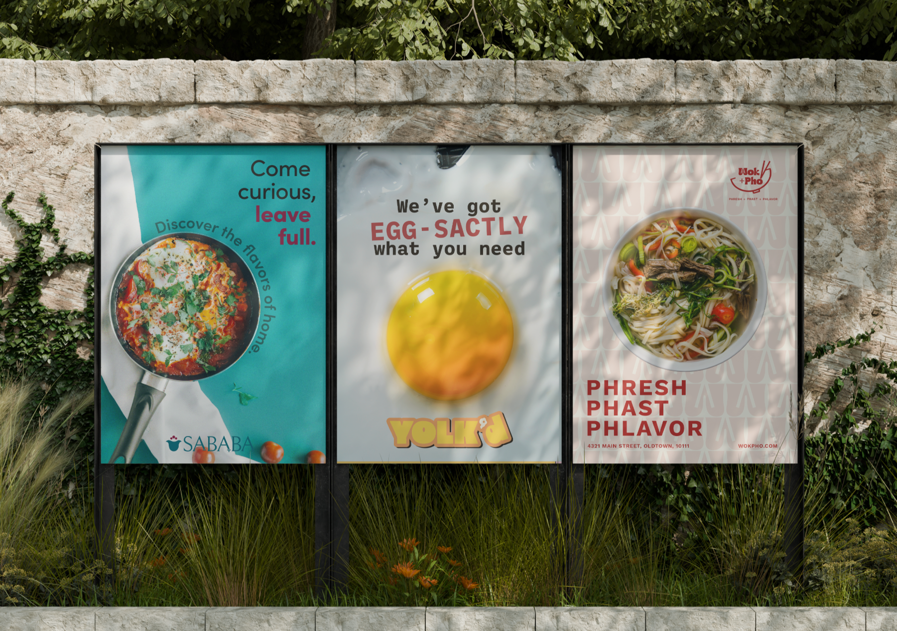
Food and design share one thing in common: They both tell stories. This series brings that idea to life through three unique restaurant brands – Yolk’d, Wok + Pho, and Sababa. Each one captures a distinct cultural flavor and mood, from the playful energy of brunch with friends to the comforting warmth of a home-cooked meal. Together, they show how thoughtful design can make you feel something before you even take a bite.
FIRST LAYOVERWok + Pho
Flight Path
Flavorful, Vibrant, Modern
Flight No.
2022, 2025
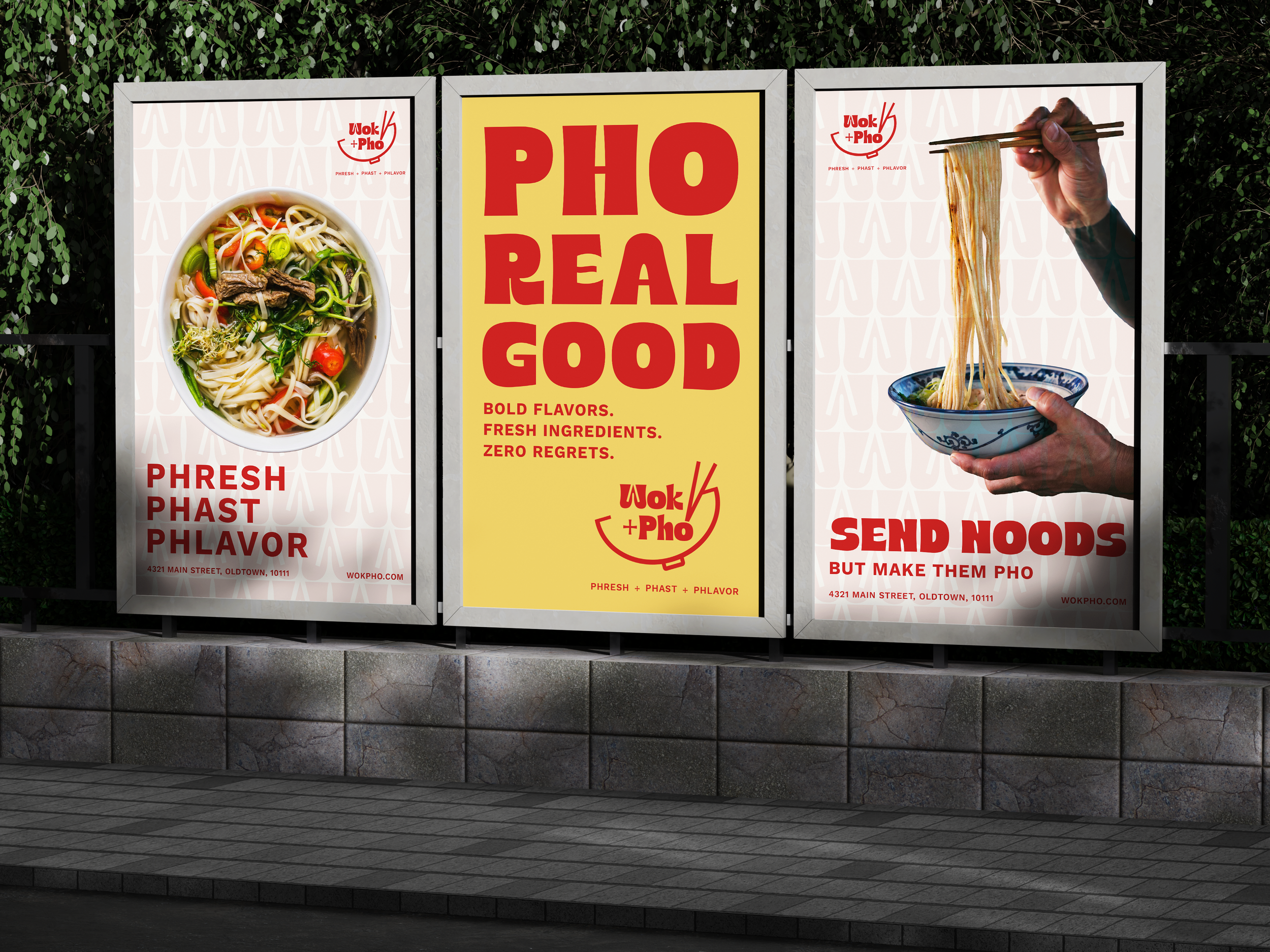
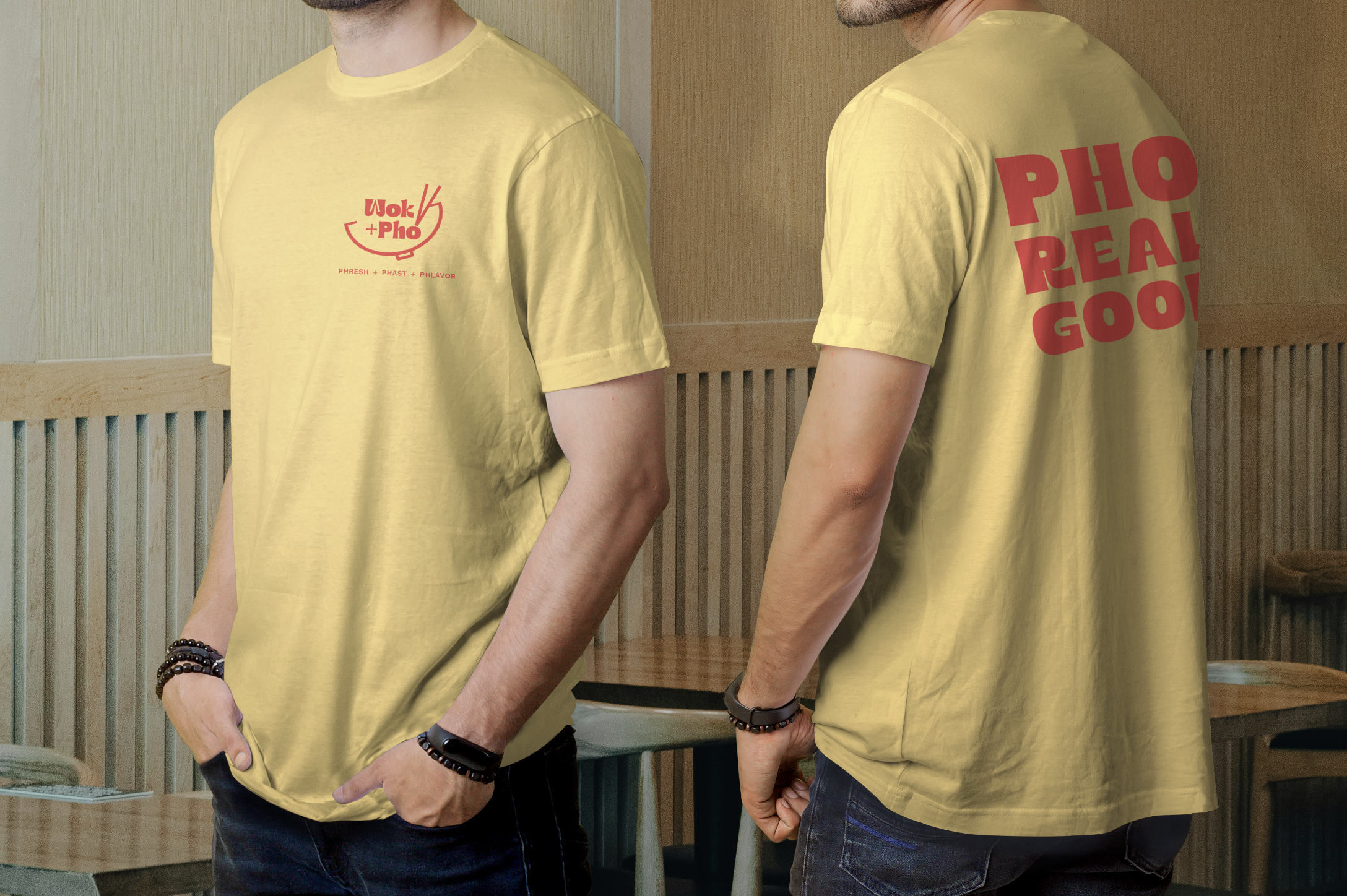
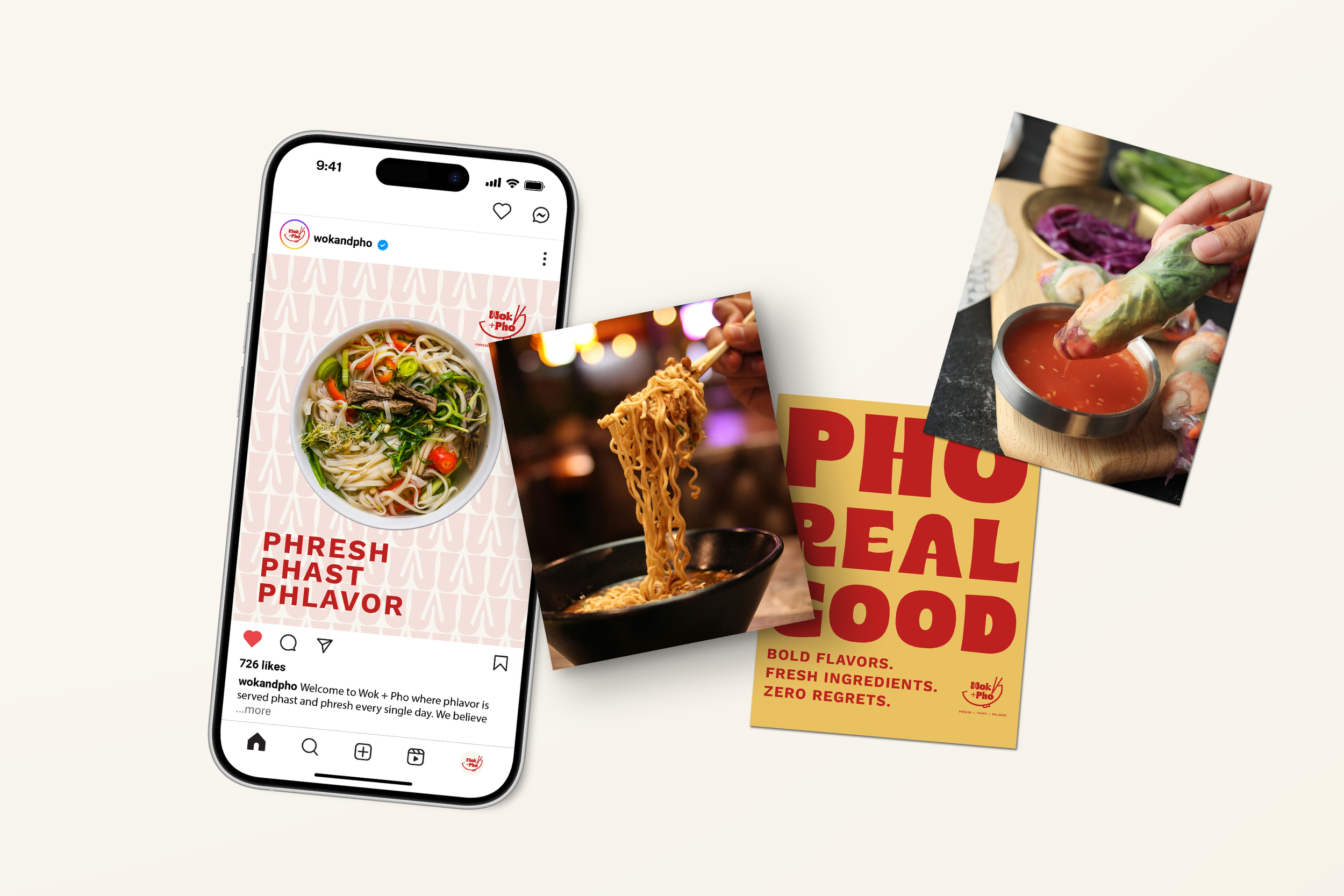
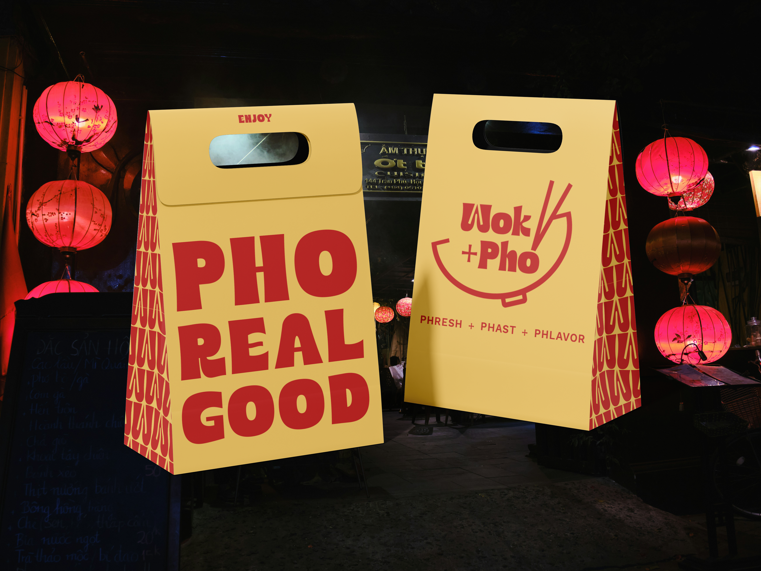
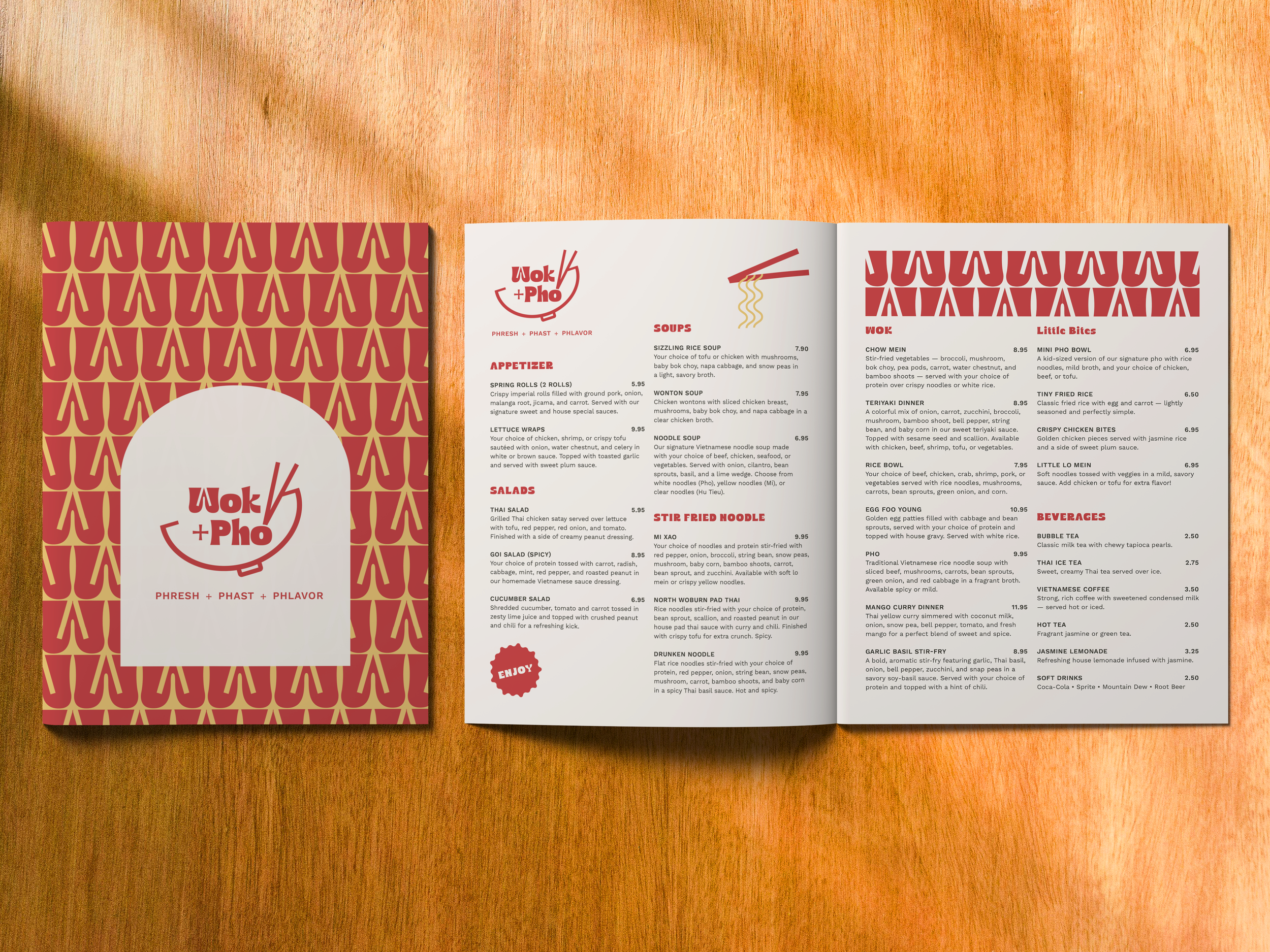
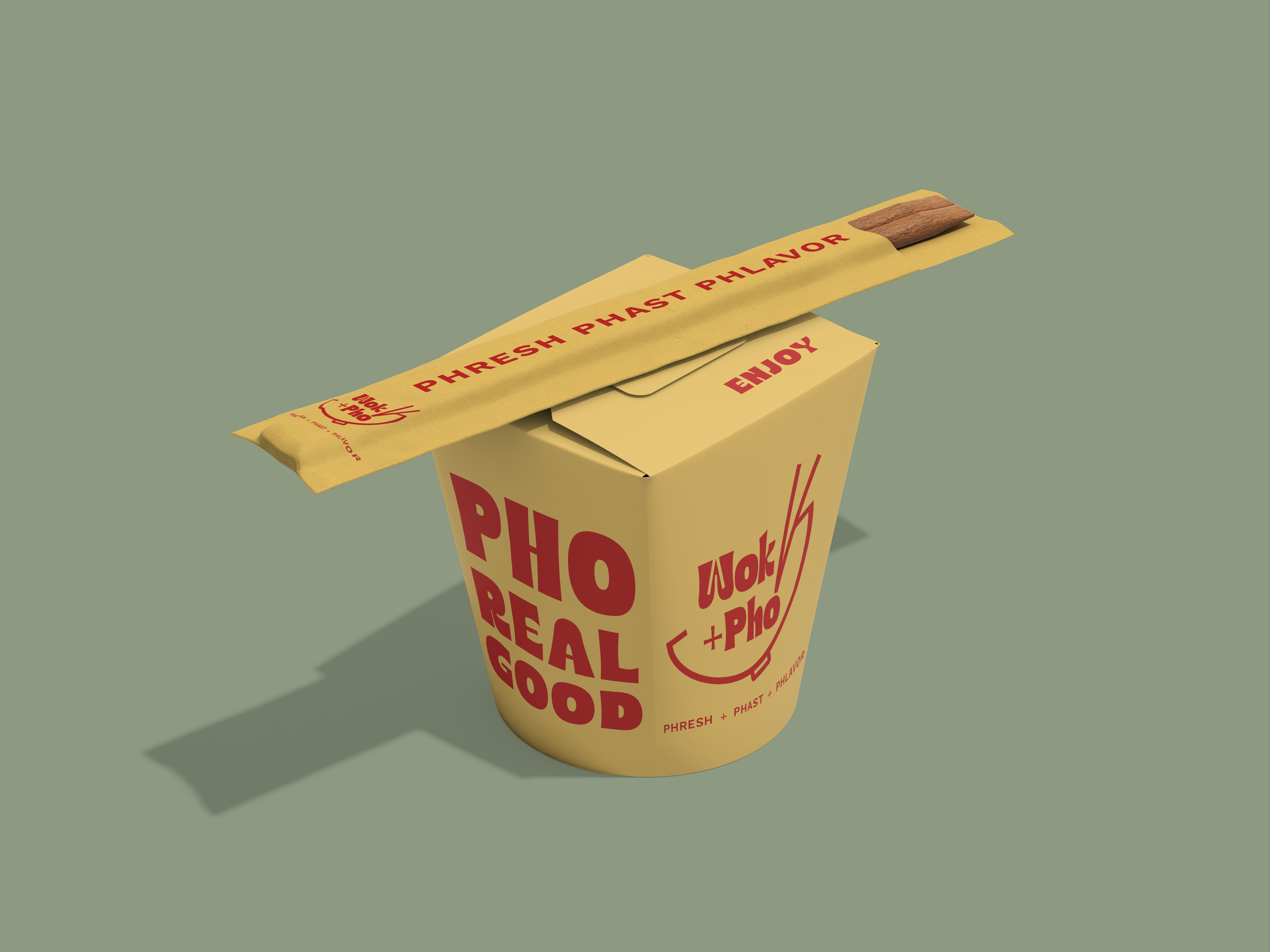
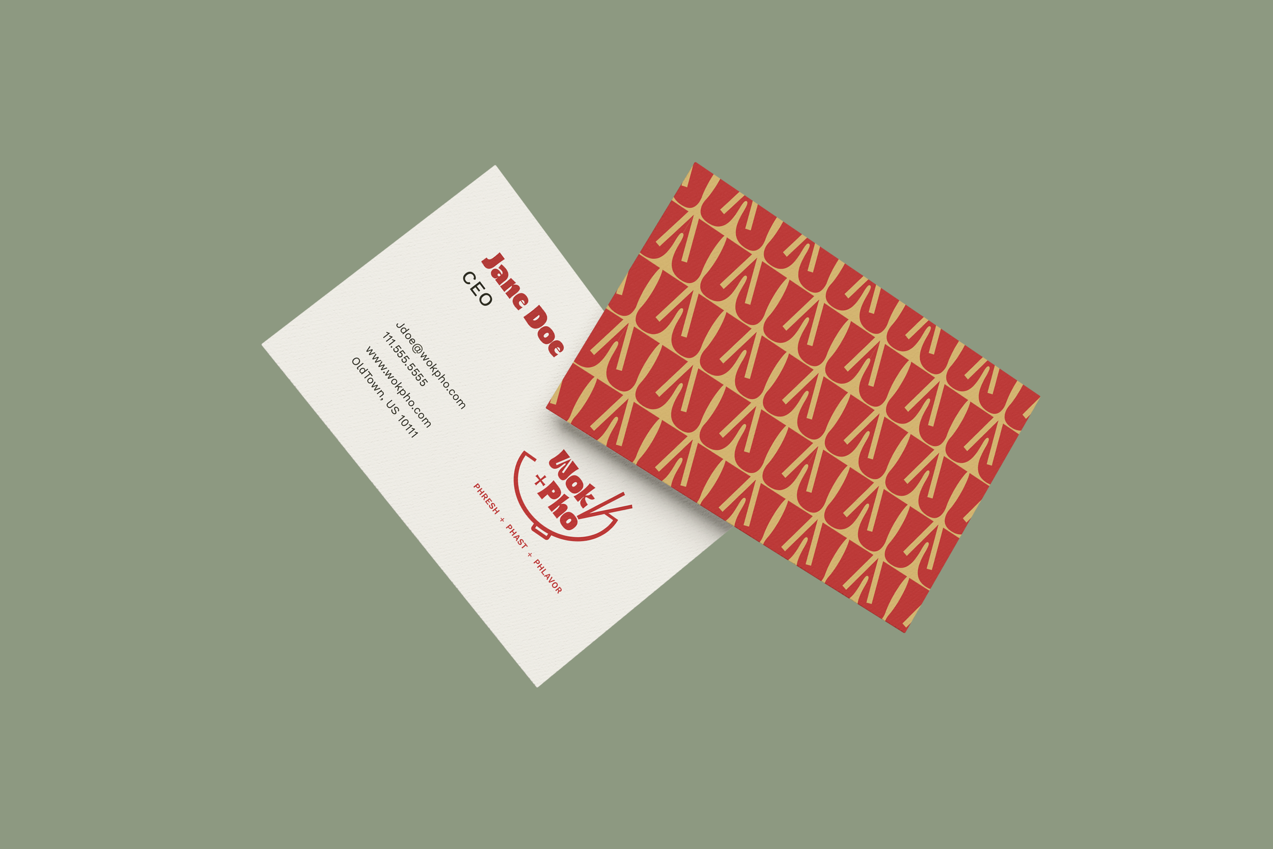
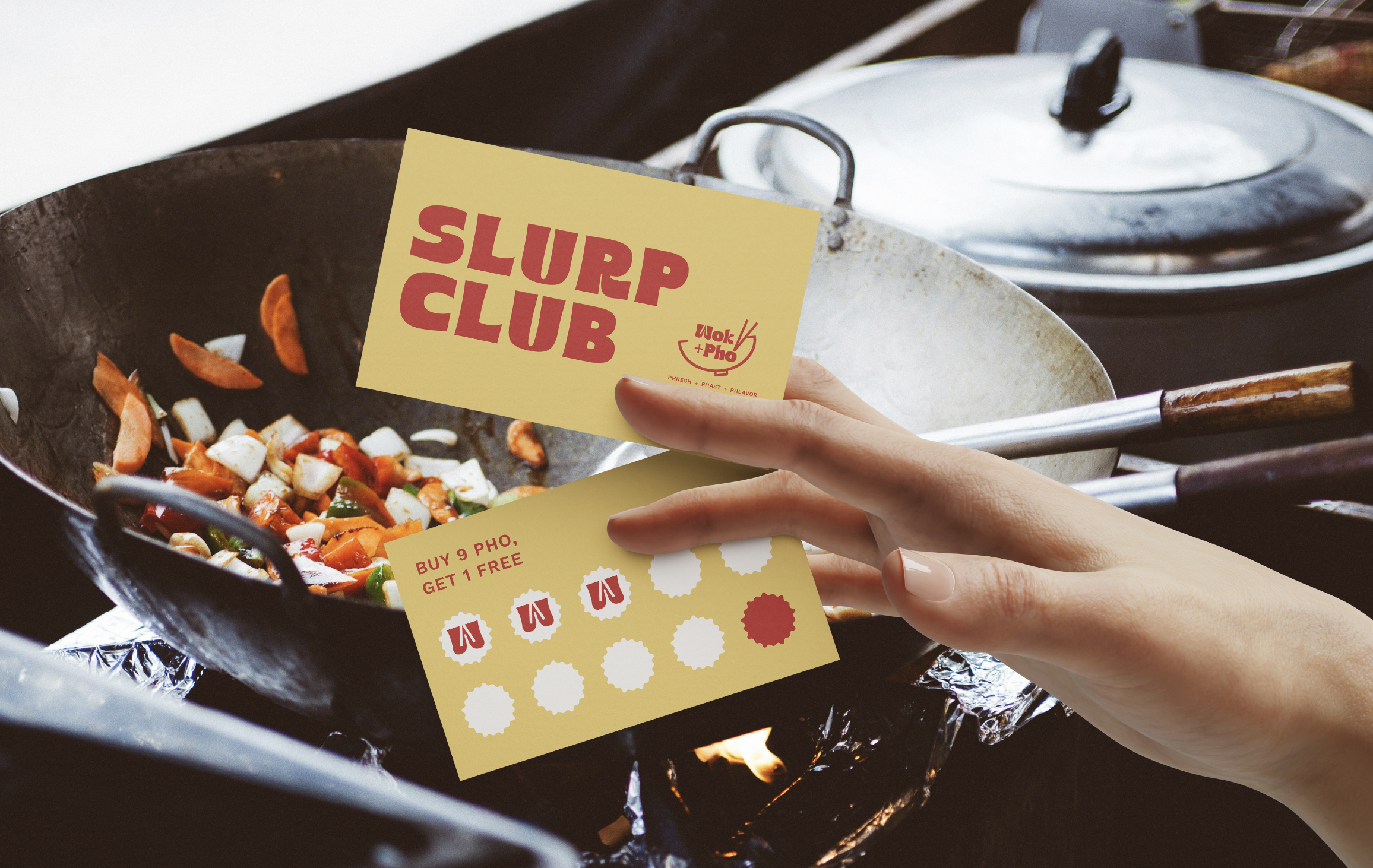
Wok + Pho is a modern Vietnamese fusion restaurant concept blending tradition with a contemporary edge. The visual identity is bold and inviting, using clean layouts, fresh color, and confident typography to reflect the balance of comfort and sophistication—flavorful, modern, and full of life.
For Wok + Pho, I paired Ristoy and Work Sans to balance playfulness with clarity. Ristoy’s bold, curvy letterforms bring energy and movement, capturing that phresh, phast, phlavor vibe, while Work Sans keeps the system clean, modern, and easy to read. Together, they create a look that’s dynamic, welcoming, and grounded.
Type Choice
The Wok + Pho palette balances warmth and energy. Spicy red and golden yellow bring heat and richness, while sage green grounds the palette with an earthy calm. Rich black and soft cream add contrast, and a punch of coral pink ties everything together with a fresh, contemporary twist.
Color Choice
For Wok + Pho, I designed a logo that feels culturally rooted and welcoming. Inspired by Vietnamese design and the food itself, it reflects a fresh, comforting experience—authentic, flavorful, and made with care. The mark stays approachable and modern while honoring the culture and craft behind the cuisine.
Getting the Logo
For the final Wok + Pho logo, I paired a bowl and chopsticks with a retro-inspired typeface. The mark connects directly to the food, with clean lines that feel warm, modern, and approachable. Repeating the chopsticks in the opening of the “W” ties the concept together, balancing personality and polish.
Perfecting the Logo

I believe I achieved my intent by creating a cohesive identity that captures both authenticity and approachability. The strong logo design paired with warm colors and simple typography gives the brand a confident yet welcoming presence. Wok + Pho is meant to feel like a modern classic, a restaurant that honors tradition while embracing creativity and community.
Intent
SECOND LAYOVERYolk’d
Flight Path
Playful, Vibrant, Social
Flight No.
2025
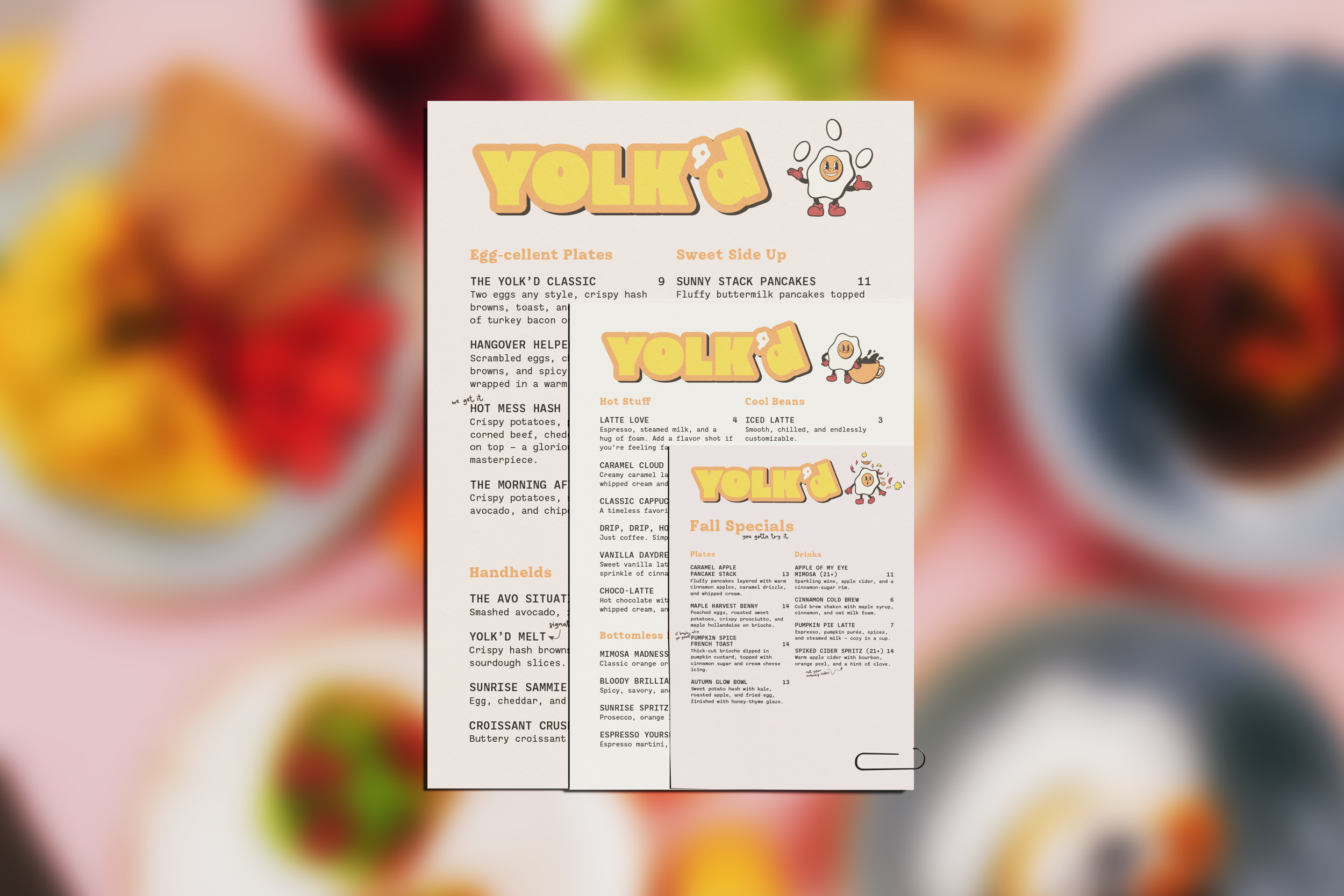
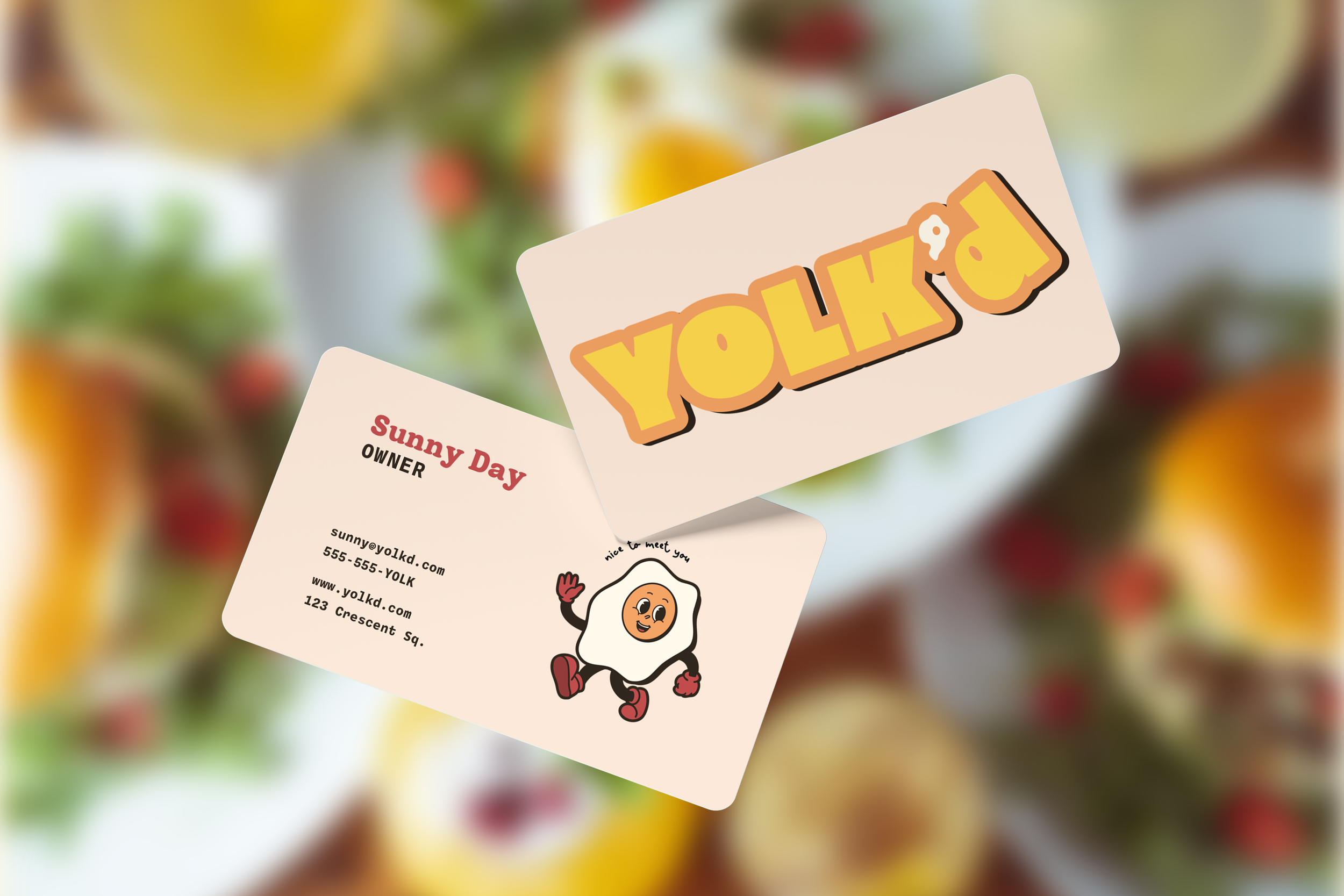
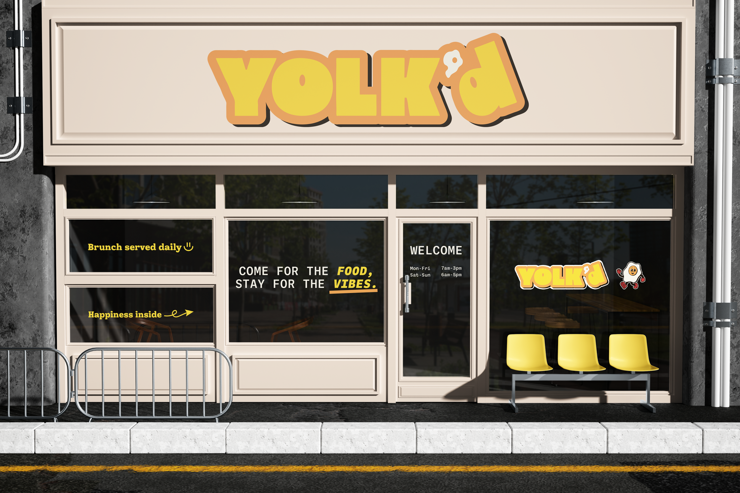
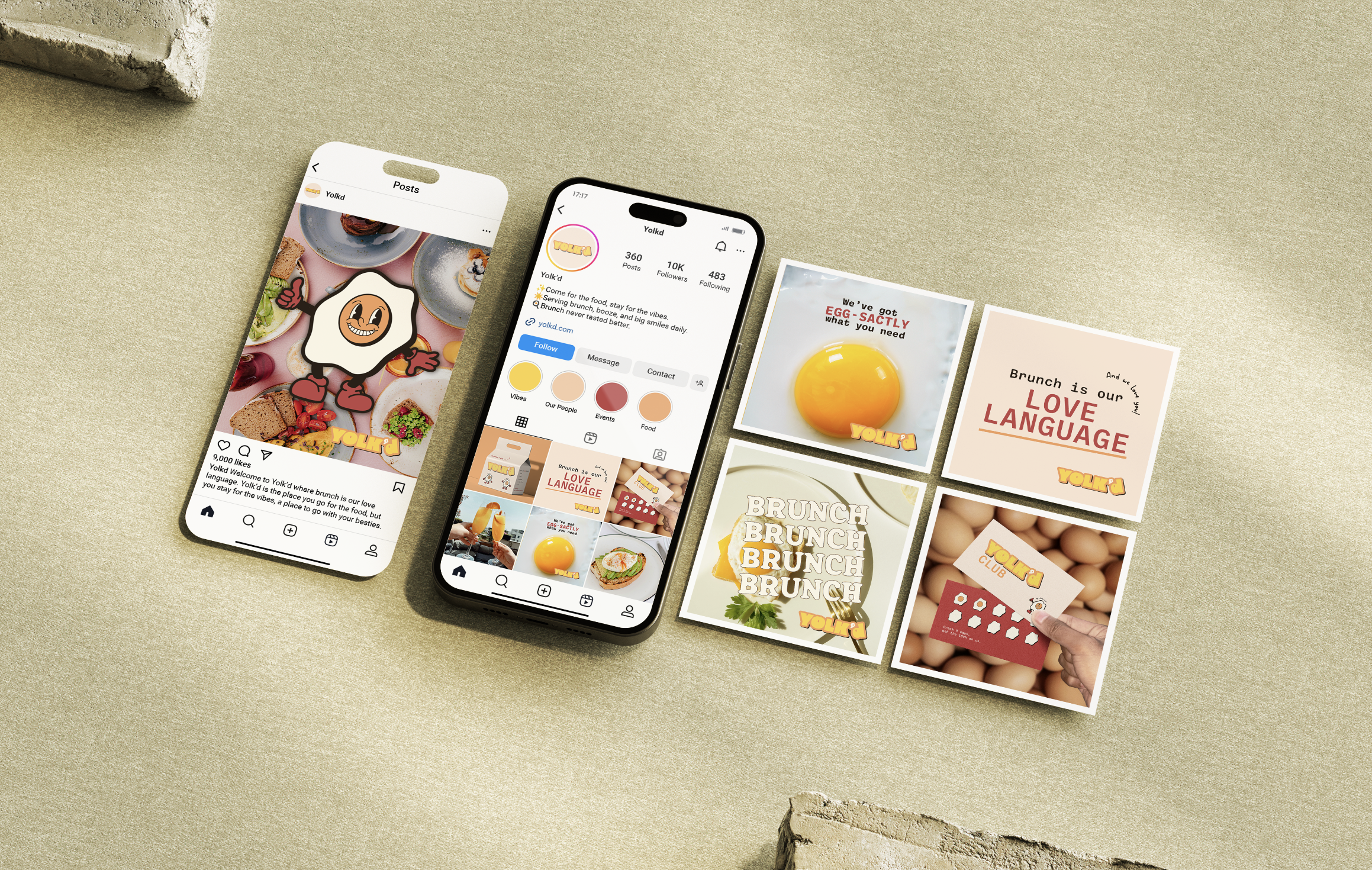
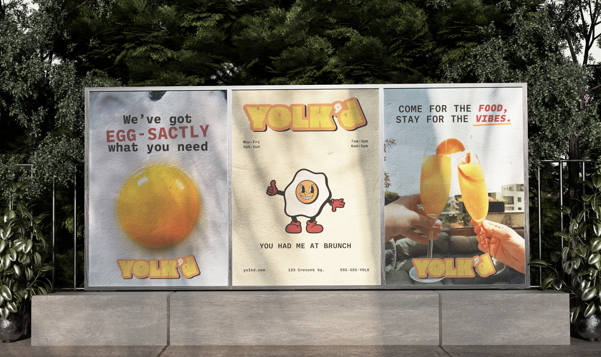
Yolk’d is all about good food, good friends, and good vibes. Designed as a fun, modern brunch brand, it captures that weekend-every-day energy with bold visuals made to stand out—and look great on Instagram. Think bottomless mimosas, loud laughter, and a menu with just as much personality.
For Yolk’d, the typography is as bold as the brand. Retro Brunch Serif brings a cheeky, nostalgic energy to headlines, Ballinger keeps the system clean and readable, and Coffe Latime adds a handwritten touch for that brunch-with-friends warmth. Together, they create a dynamic, trendy system that feels energetic and effortlessly welcoming.
Type Choice
The Yolk’d palette is bright, bold, and full of personality. Sunny yellow leads with warmth, peach orange adds approachability, and sky blue keeps things fresh. Red brings social energy, while off-white and espresso brown ground the palette—cheerful, modern, and made to spark joy.
Color Choice
For the Yolk’d logo sketches, I explored playful, brunch-inspired elements that felt recognizable without being cliché. The final direction balances bold simplicity with warmth and approachability, capturing the easygoing joy of a perfect brunch spot.
Getting the Logo
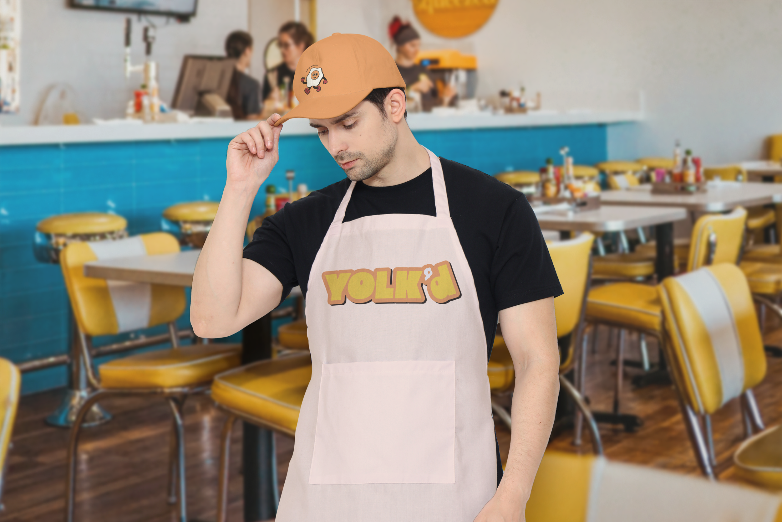
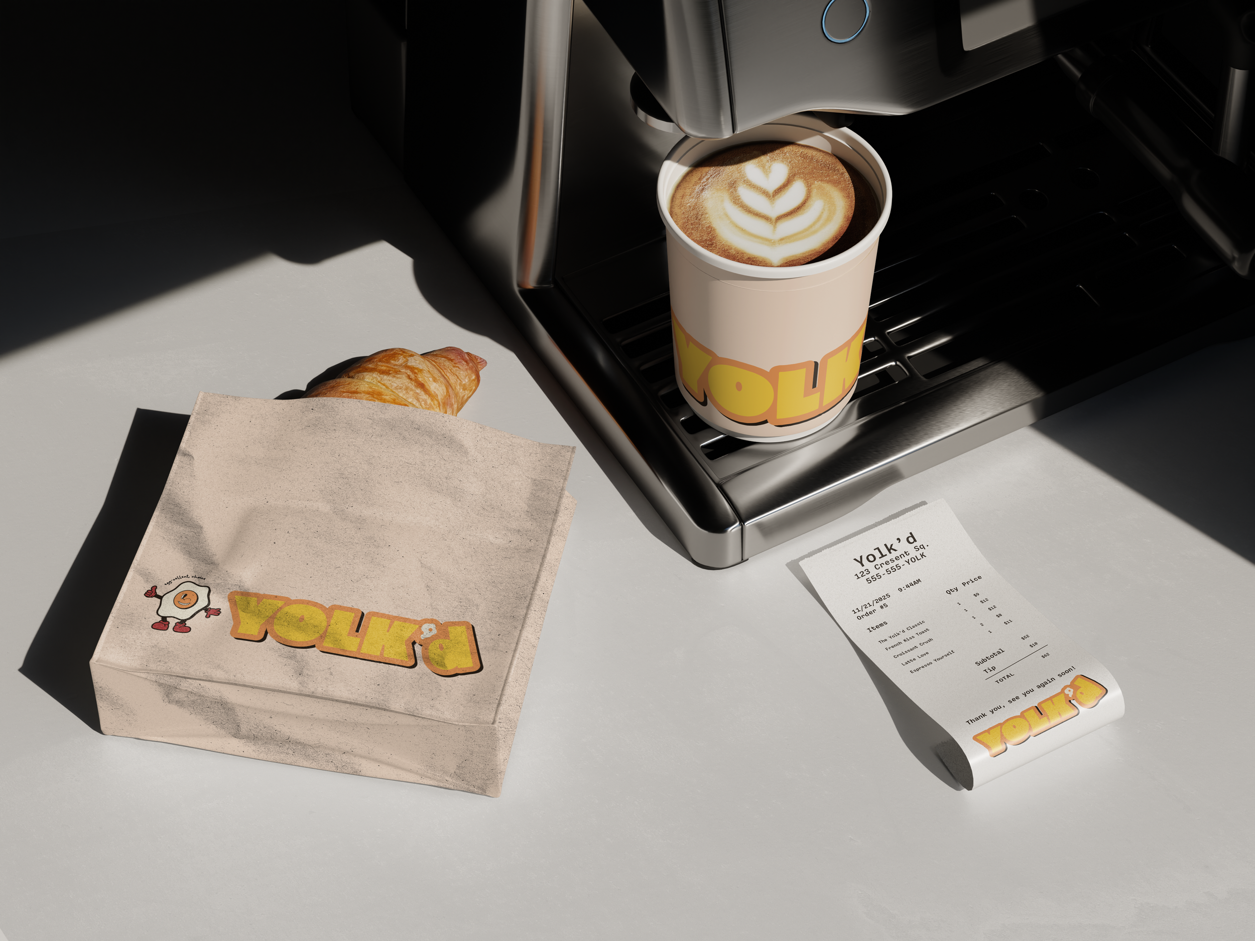
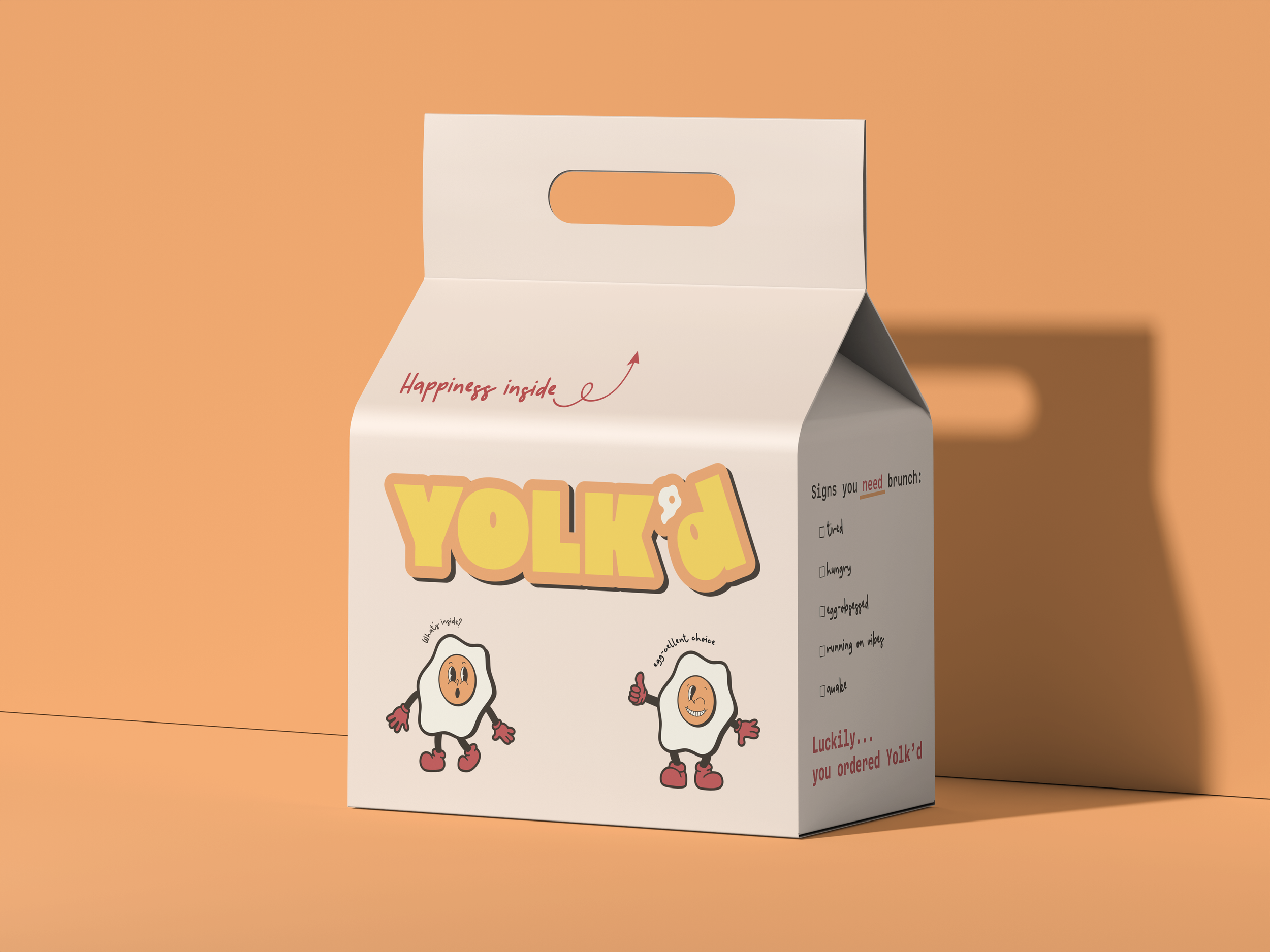
For the final Yolk’d logo, I designed something bold, fun, and eye-catching that was made to stop you mid-scroll or turn heads on the street. Turning the apostrophe into a sunny-side-up egg adds a playful, memorable detail that reinforces the brand’s lighthearted spirit. The result is a logo that feels fresh, vibrant, and made to brighten your day.
Perfecting the Logo
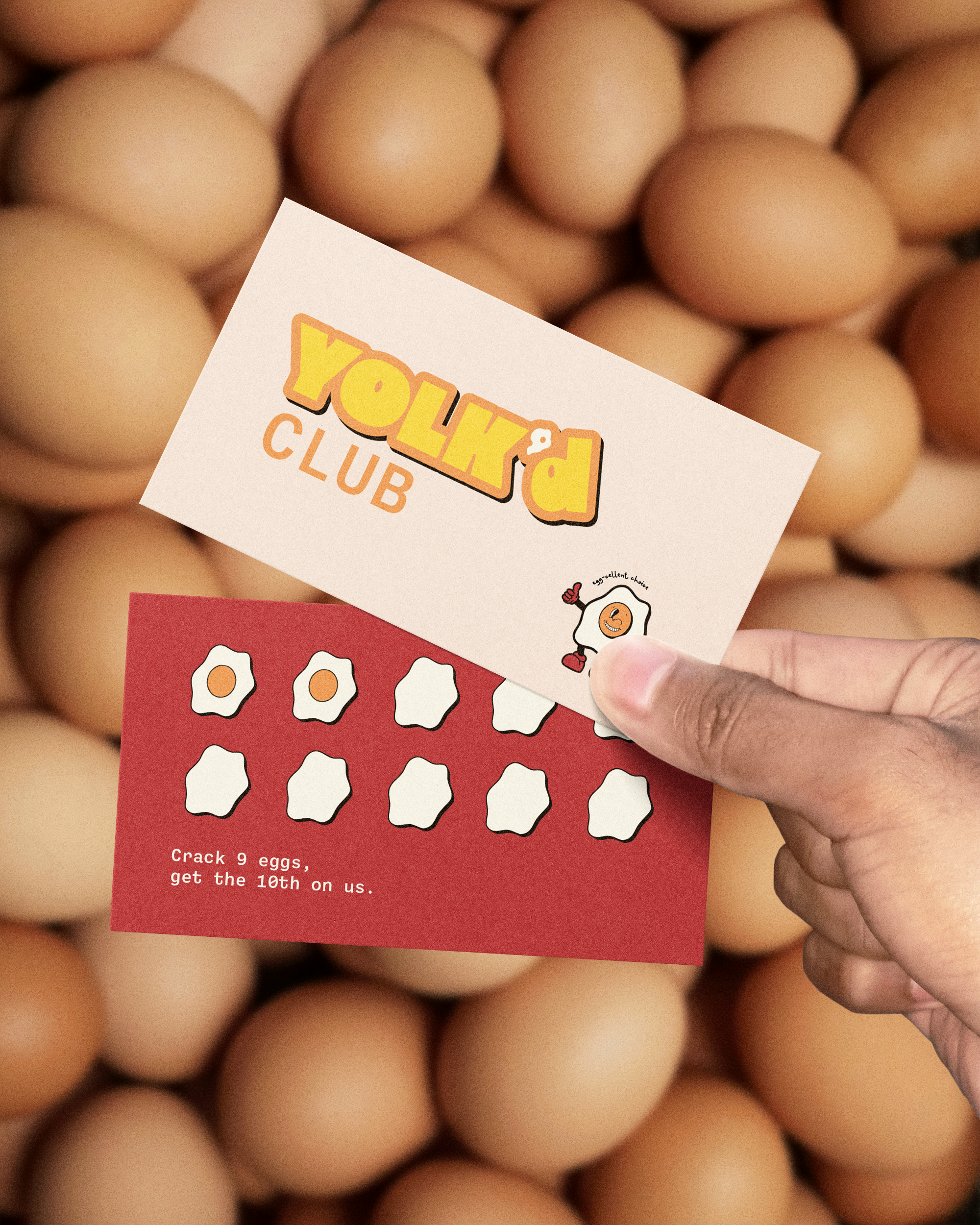
Meet Yolkey, the sunny mascot behind Yolk’d. He adds warmth, personality, and a playful touch, helping bring the brand to life across menus, merch, and social content with a character guests can instantly connect with.
Yolkey the Mascot
I believe I achieved my intent by creating a bright, energetic identity that captures the fun and comfort of a modern brunch spot. The bold yellow palette, playful typography, and simple graphic elements give Yolk’d a personality that feels fresh, youthful, and irresistibly inviting. This brand is designed to celebrate the joy of breakfast, a place where good food, good vibes, and good company come together. Yolk’d strikes the balance between trendy and approachable, making it feel like a go-to neighborhood favorite while still standing out with a memorable, cohesive visual style.
Intent
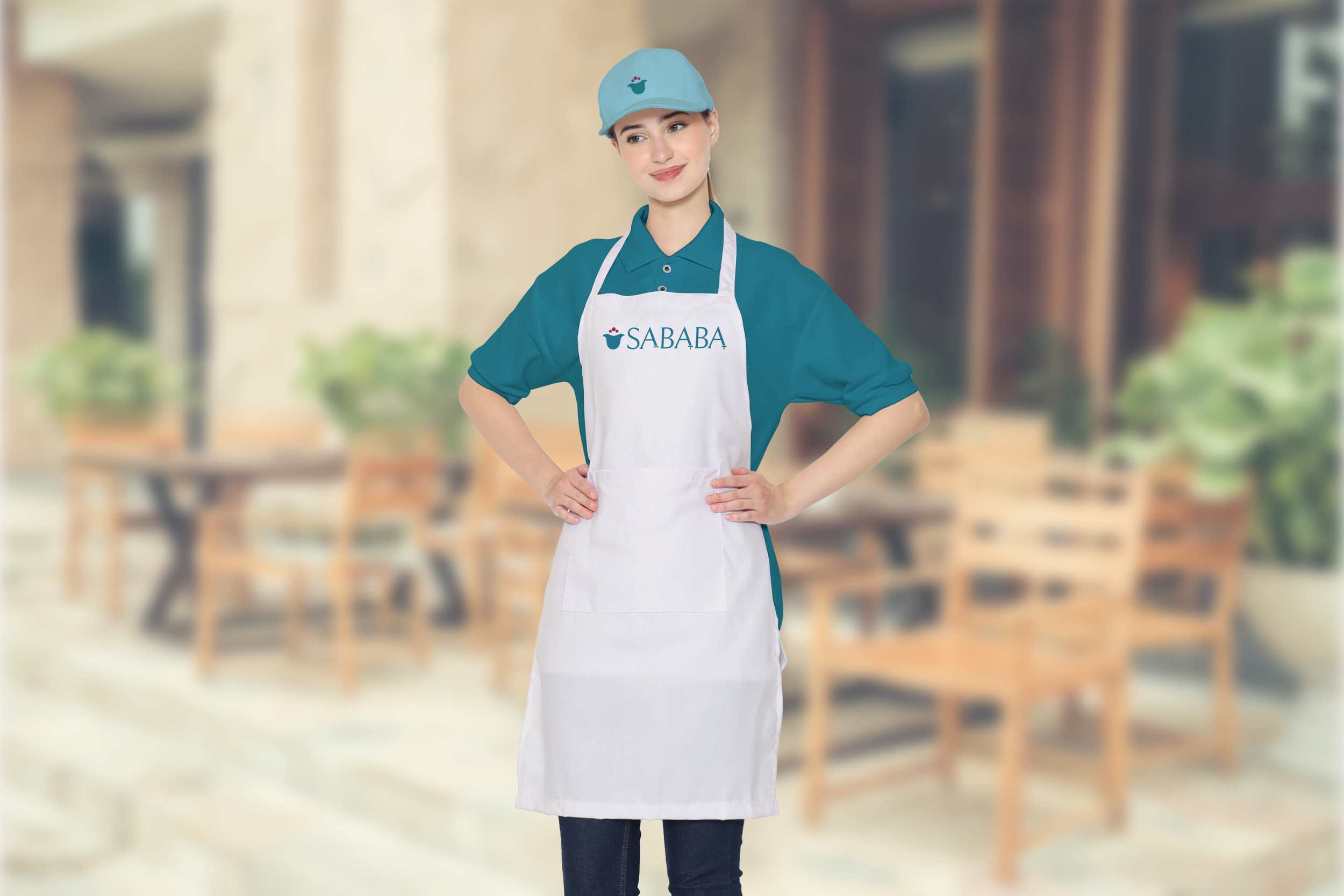
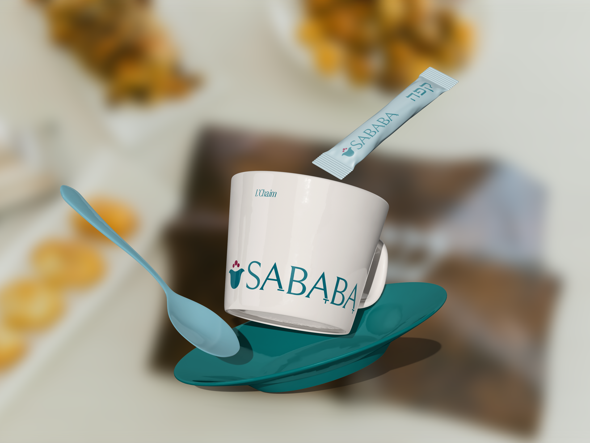
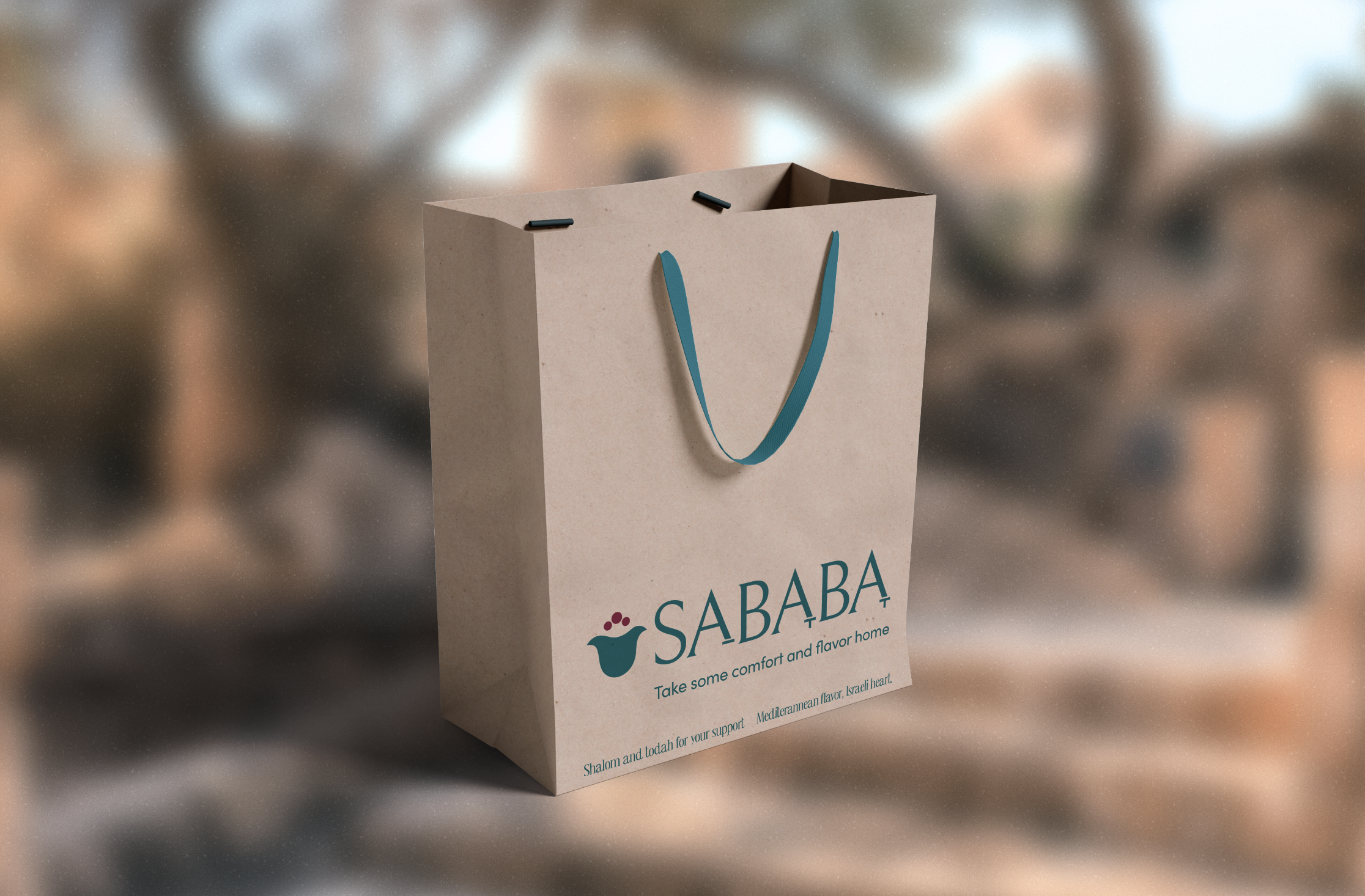
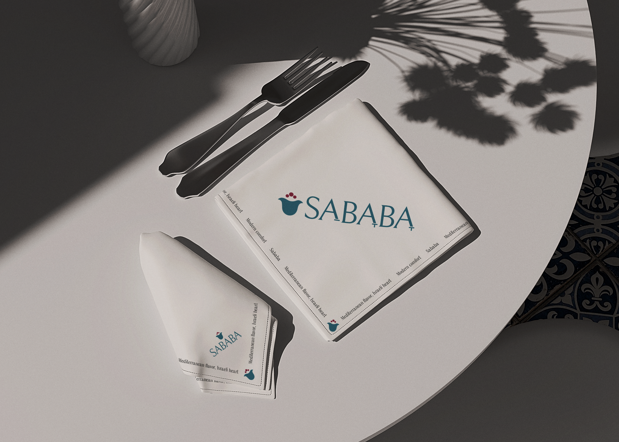
THIRD LAYOVERSababa
Flight Path
Vibrant, Fresh, Family
Flight No.
2025
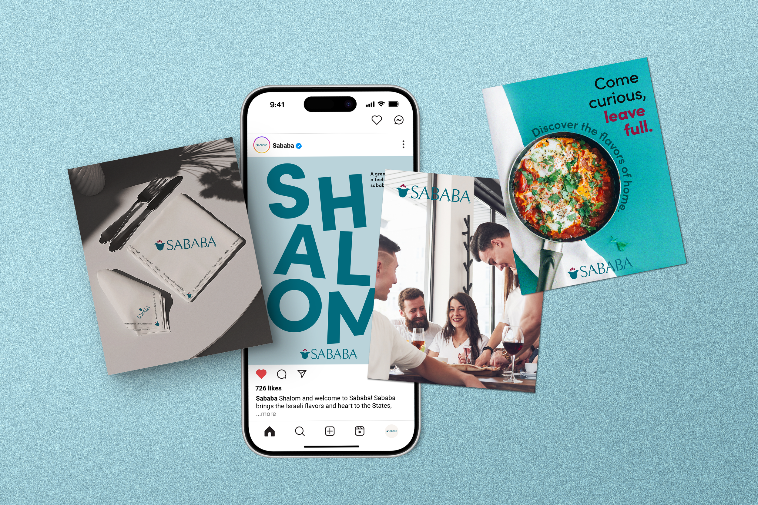
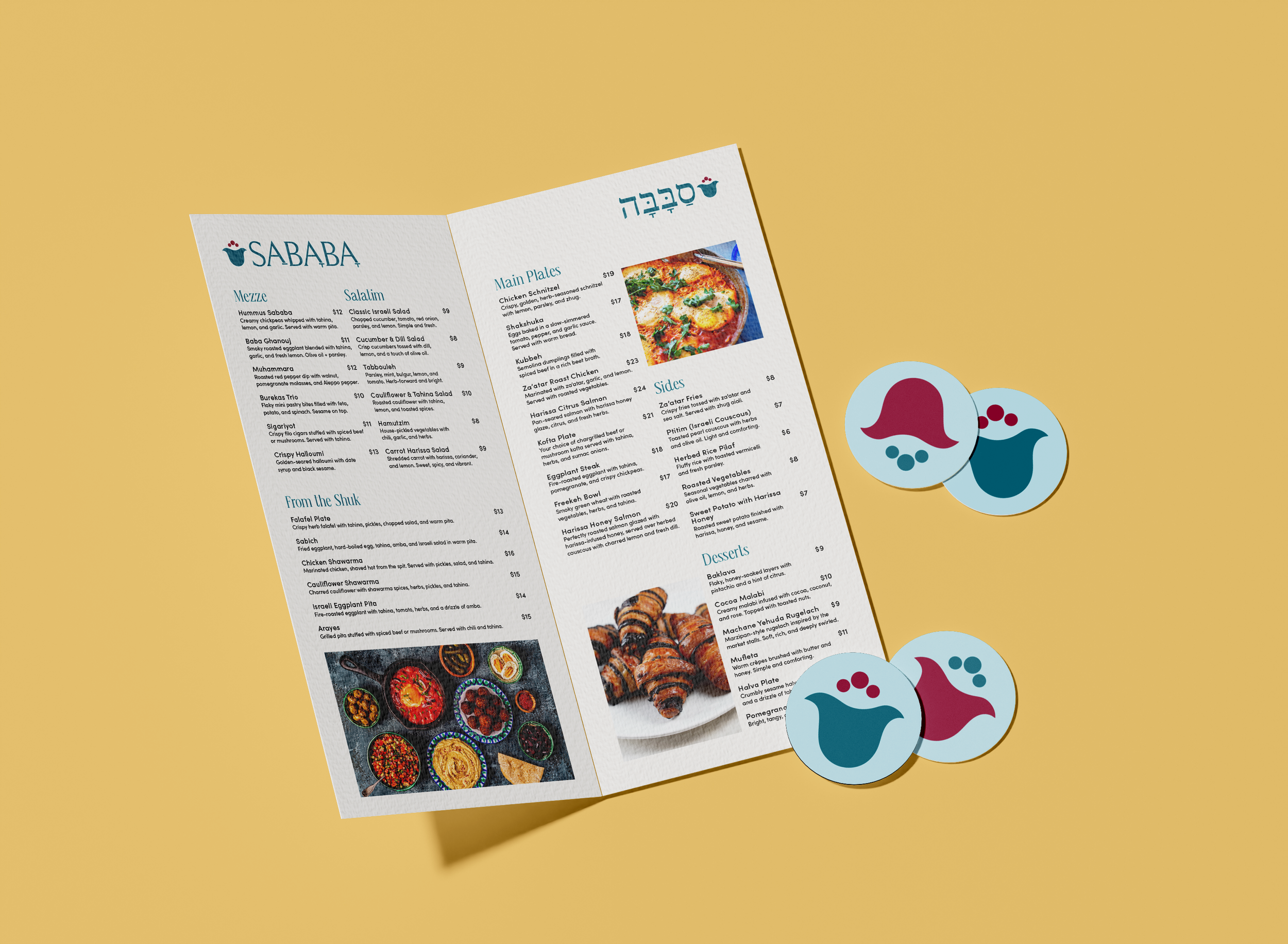
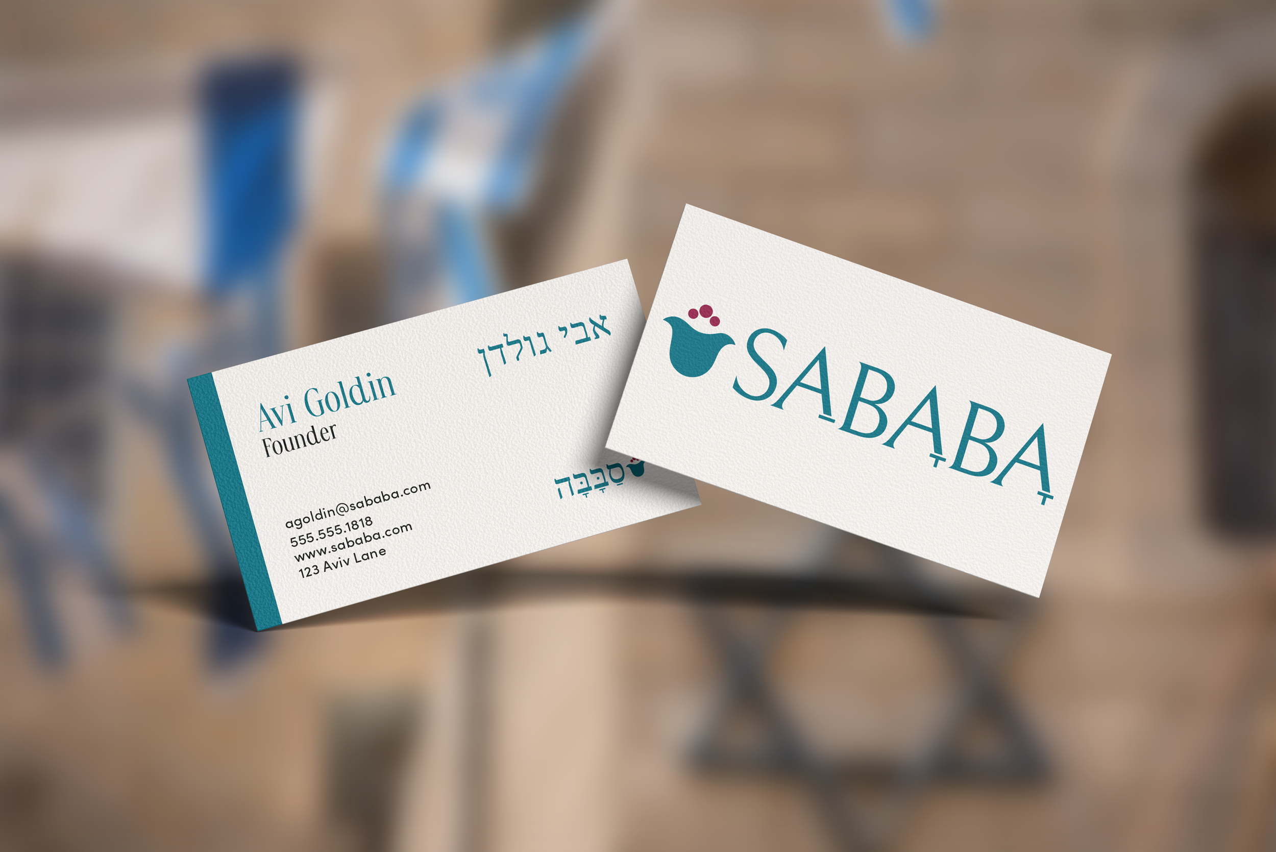
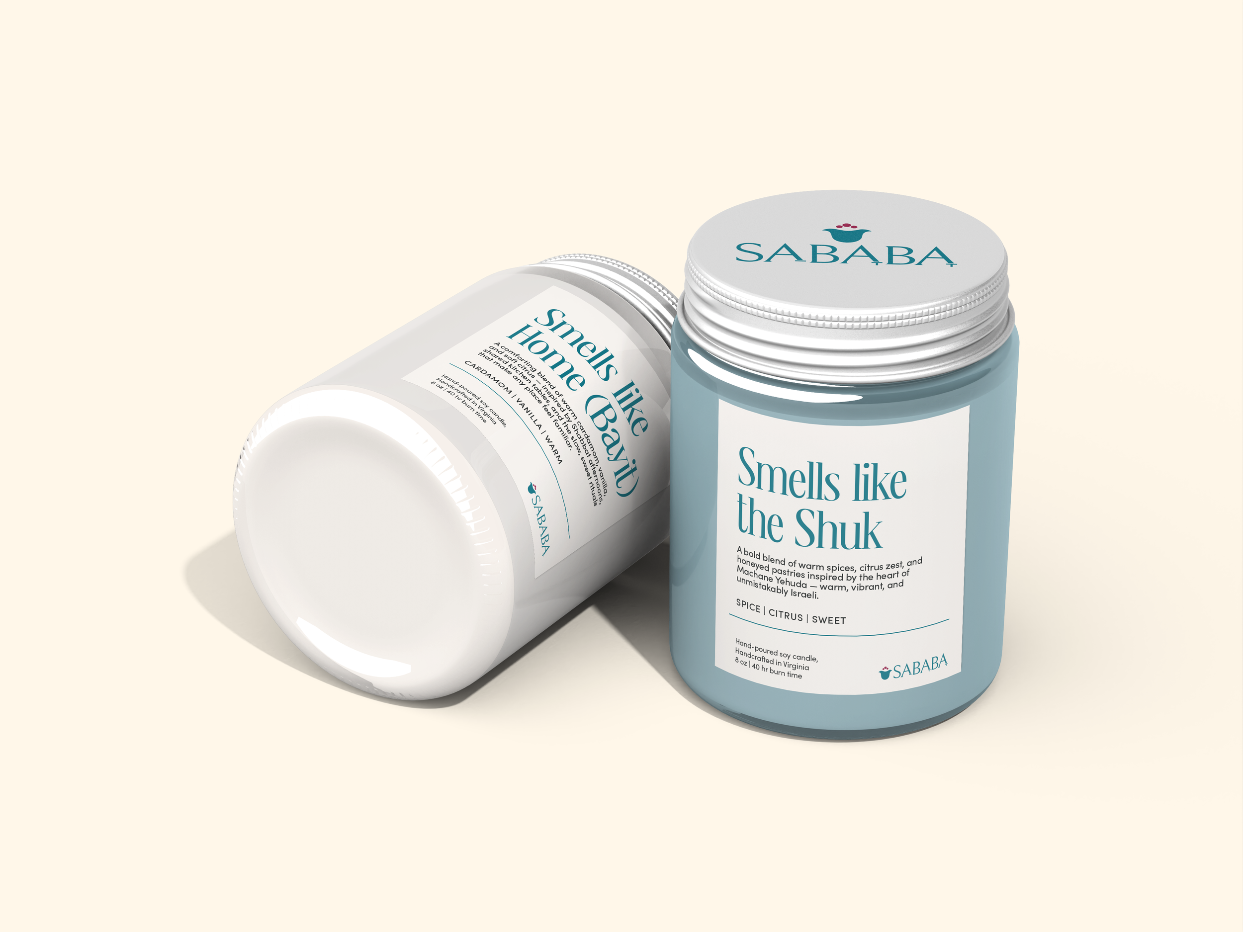
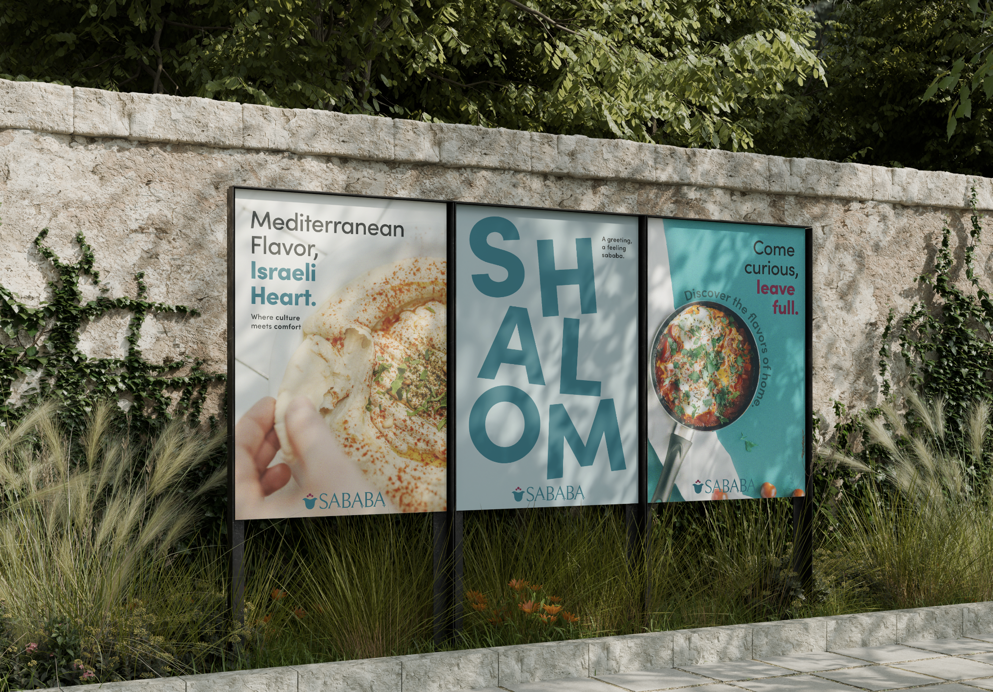
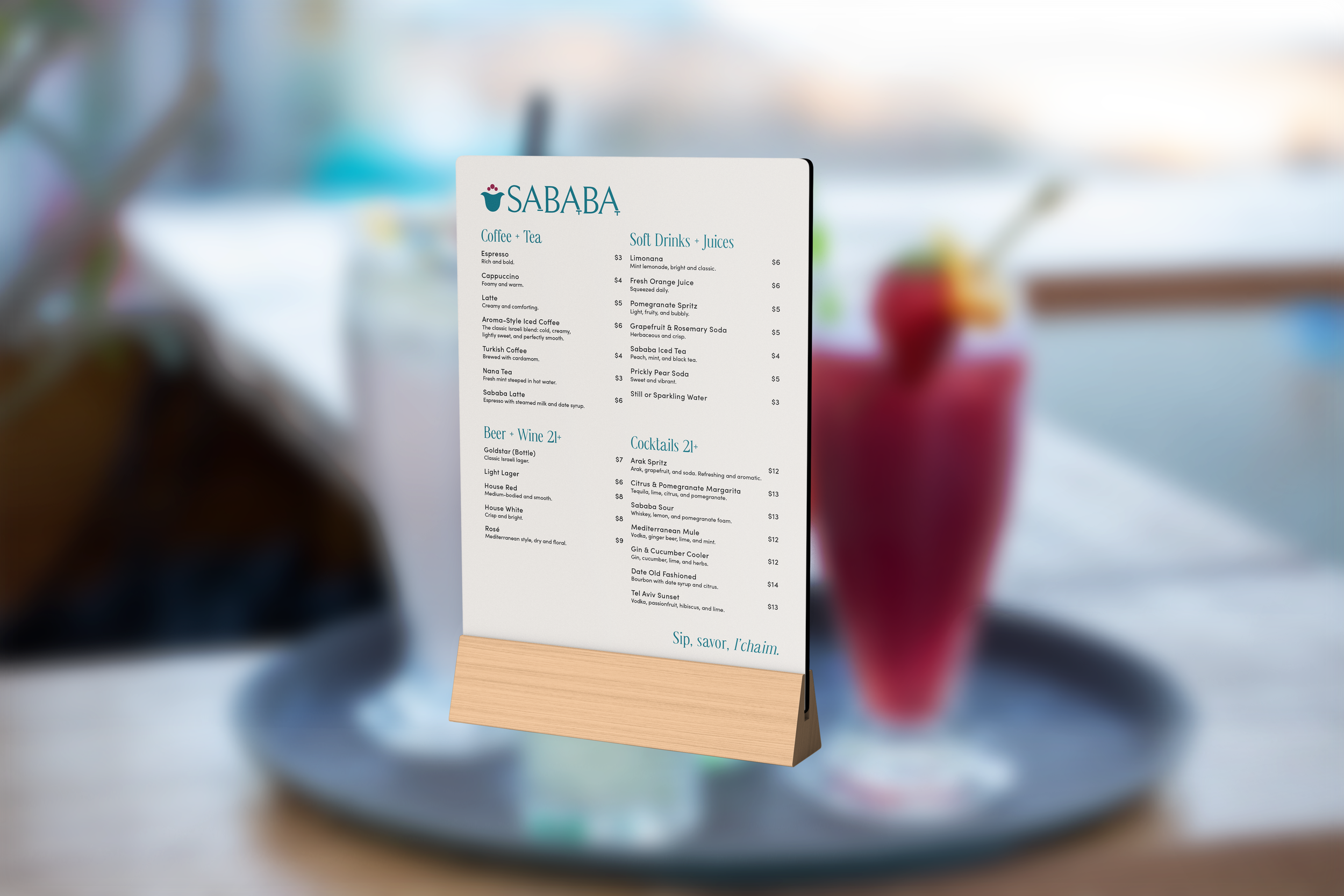
Sababa is a family-style Israeli restaurant centered on good food and good company. Named after the Hebrew slang for “all good,” the brand reflects a relaxed, feel-good energy rooted in home-cooked comfort and Jewish culture. Bright, citrus-inspired colors and approachable typography bring that warmth and sense of togetherness to life.
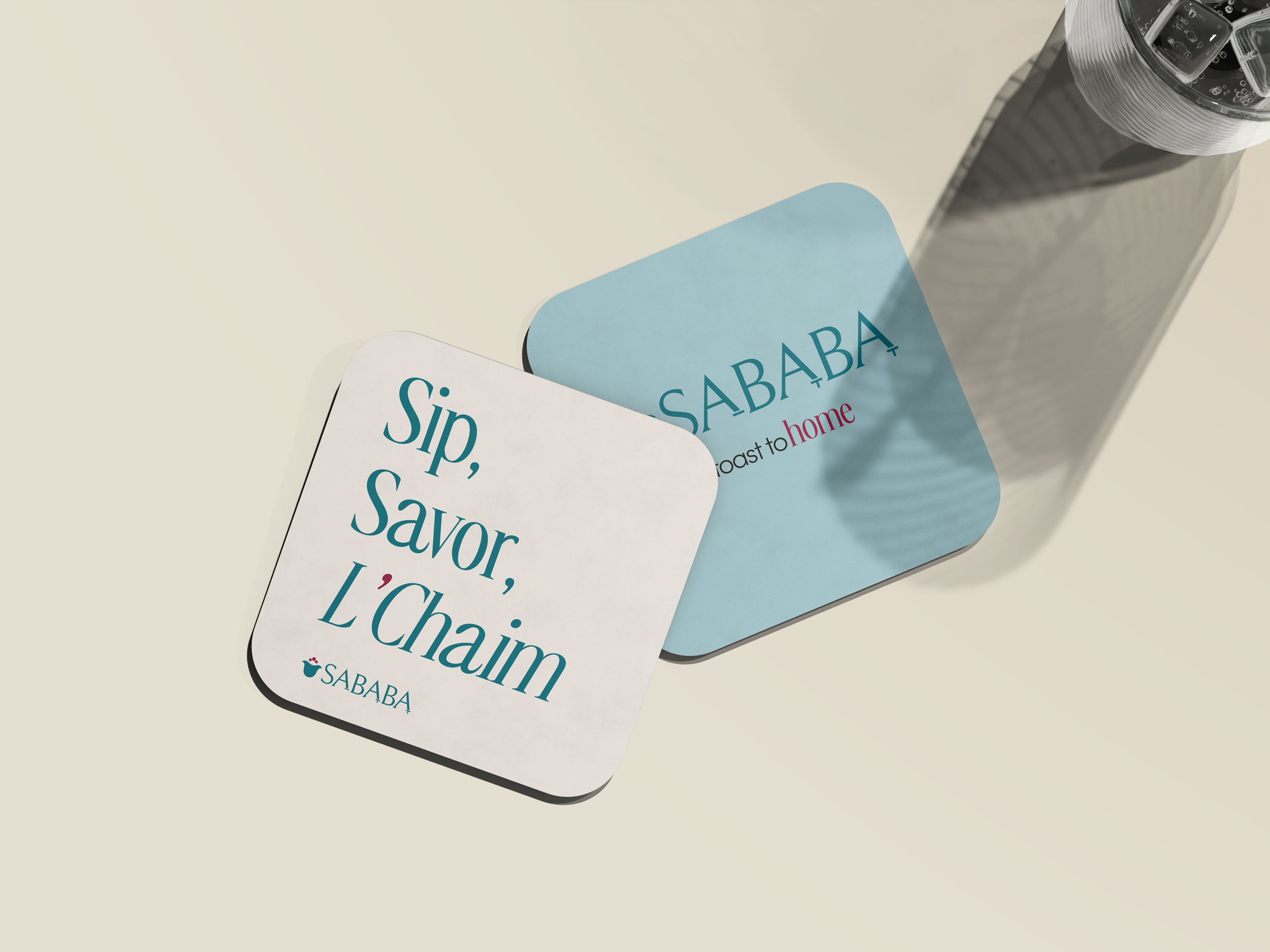
The Sababa type system balances warmth with modern refinement. CS Ristela adds elegance to headlines, Sofia Pro keeps body text clear and friendly, and Noto Serif Hebrew grounds the brand in its Israeli roots—creating a cohesive, authentic visual voice.
Type Choice
The Sababa palette draws from Mediterranean warmth and coastal calm. Light blue and deep teal bring freshness, pomegranate and golden hues add richness and sunlit warmth, and terracotta grounds the palette with earthy vibrancy. Porcelain white keeps things airy, while midnight olive anchors the system—creating a look that feels welcoming, heartfelt, and unmistakably Sababa.
Color Choice
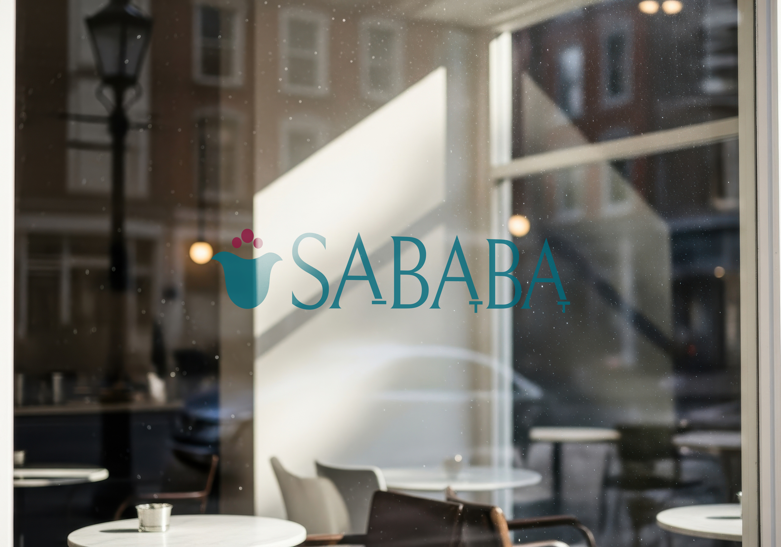
For Sababa’s logo, I blended clean English letterforms with subtle Hebrew vowels to create something instantly welcoming and culturally rooted. An abstract hamsa adds meaning without overwhelming the design, resulting in a mark that feels warm, modern, and effortlessly approachable.
Mixed Logo
The animated Sababa logo brings the brand’s upbeat, welcoming spirit to life. Inspired by Mediterranean street culture, the motion adds a playful, handmade energy that reinforces Sababa’s warm, community-driven identity across digital spaces.
Animated Logo
I believe I achieved my intent by creating a brand that balances cultural authenticity with a warm, modern dining experience. Through thoughtful typography, meaningful Hebrew-inspired details, and a color palette rooted in Mediterranean warmth, Sababa feels both familiar and intriguing. The visual identity celebrates Israeli flavors and traditions while staying approachable to all guests. Sababa is meant to embody comfort, community, and cultural heart — a destination restaurant that feels like home, whether you grew up with these dishes or are discovering them for the first time.
Intent