NOW ARRIVINGJewess
Gate
Research Design
Flight Path
Reclamation, Identity, Pride
Flight No.
2024-2025
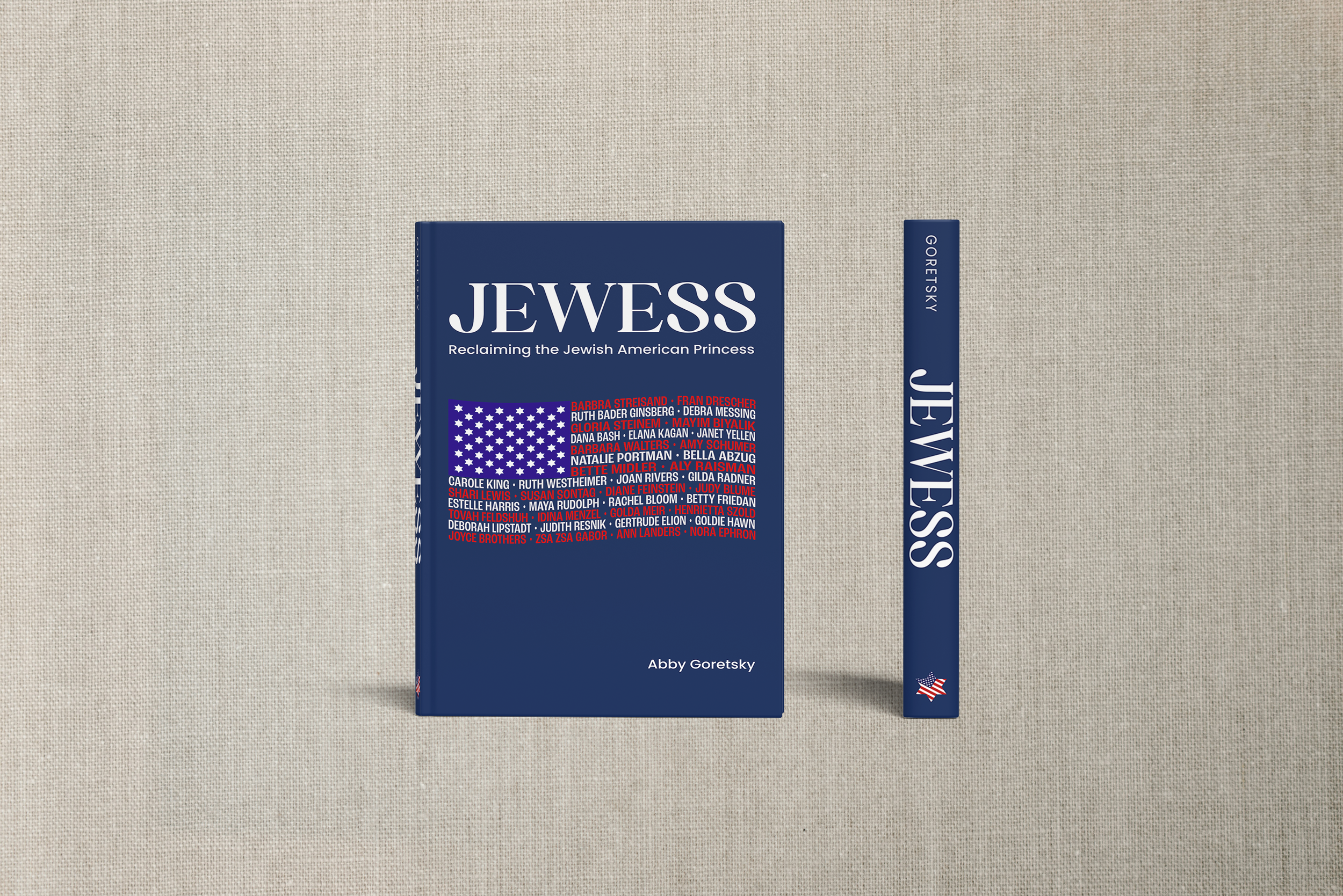
Jewess began as a class assignment exploring the origins and cultural implications of the term “Jewish American Princess.” The project challenged me to think critically about stereotype, identity, and representation, then translate that research into a powerful visual statement. What started as a single magazine cover honoring Jewish American women I admire evolved into a full book jacket that felt much more personal. I wanted to reclaim a harmful label through design, turning it into something rooted in pride, identity, and strength.
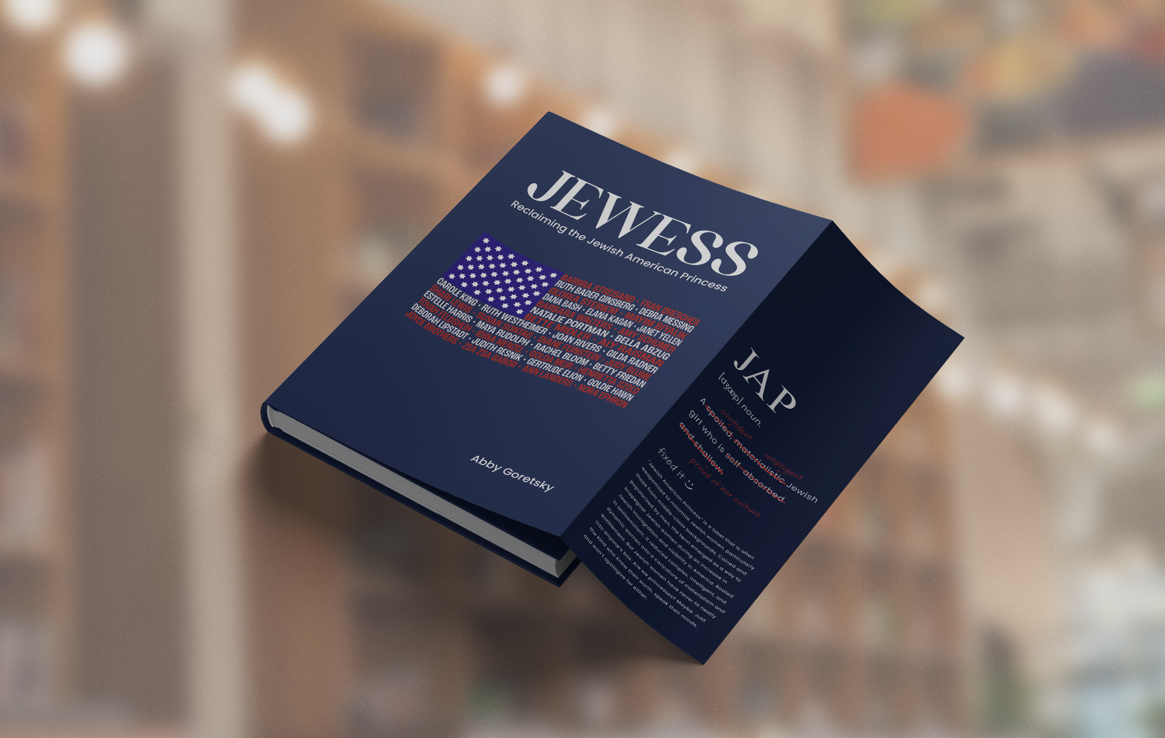
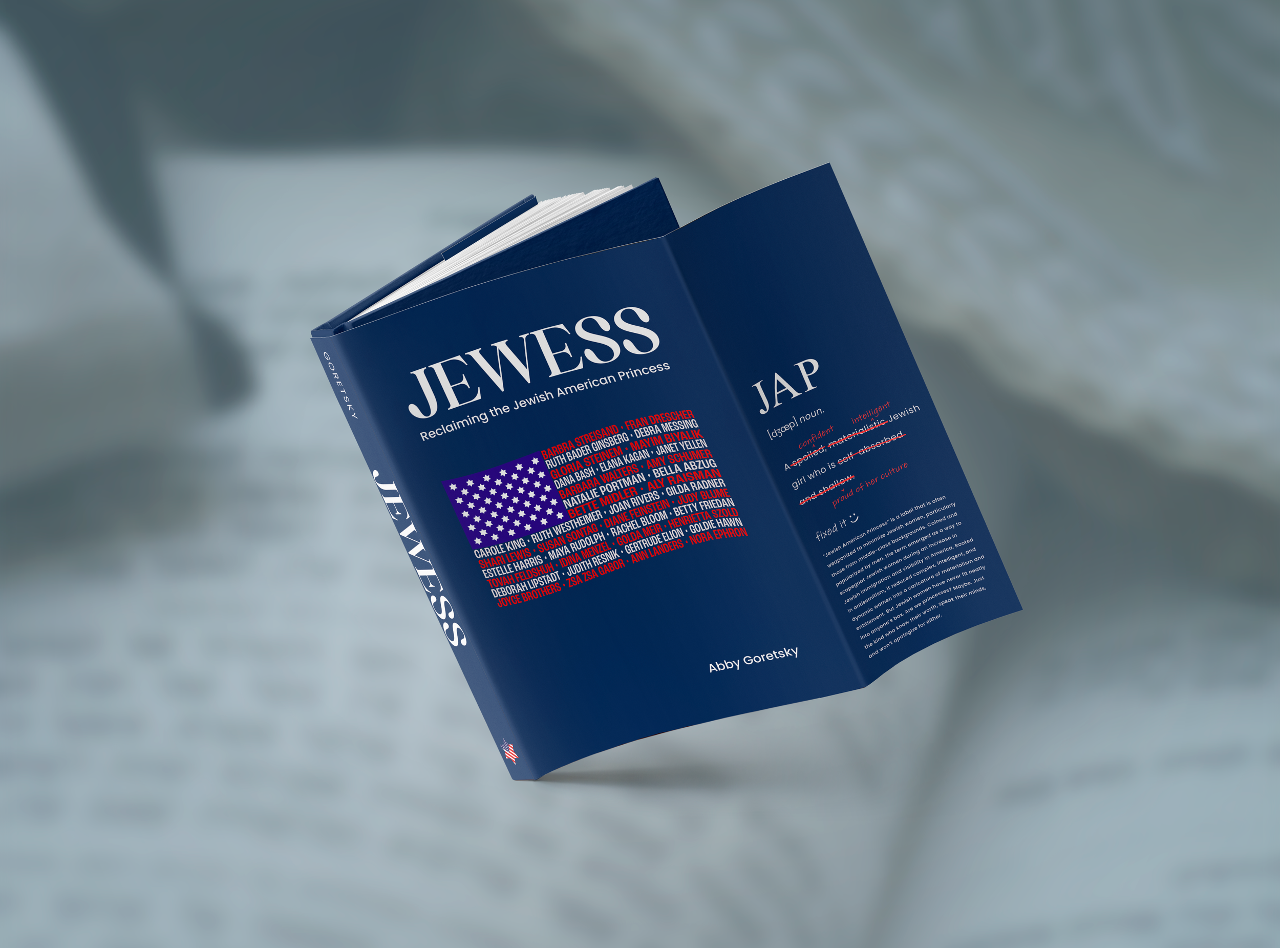
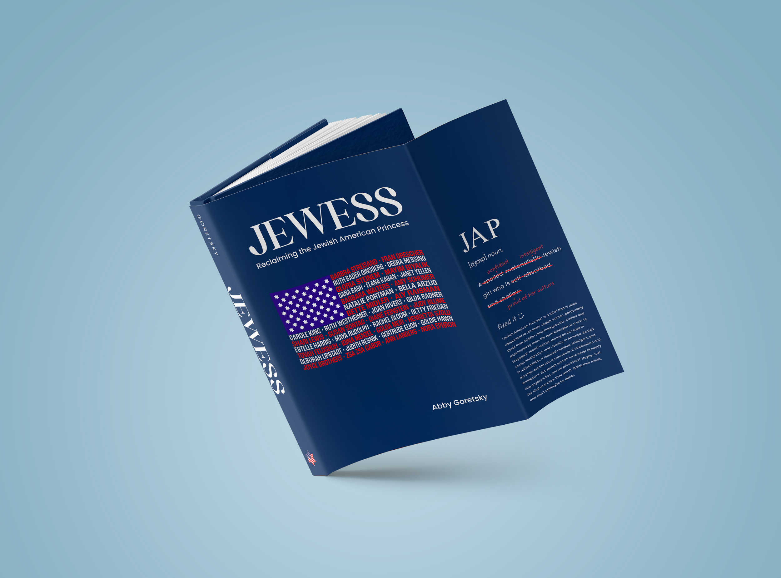
I chose Adoha for the Jewess masthead for its sculptural, magazine-style confidence. Poppins balances the layout with clean, modern readability, while Adobe Handwriting Tiffany adds handwritten accents that cross out and rewrite words—a visual nod to reclaiming and reshaping identity.
Type Choice
I used red, white, and blue as both a nod to the American flag and a commentary on identity. The palette reclaims the “American” in Jewish American Princess as pride, strength, and belonging, viewed through a Jewish lens.
Color Choice
This project began with a broad research topic that I narrowed through a word tree. Wanting to explore my heritage as a Jewish woman, I branched into themes of tradition, history, and stereotypes. The term “JAP” stood out, leading me to research it more deeply and examine its cultural impact.
Choosing ‘JAP’
I had the freedom to choose any medium, and I went digital. I landed on a magazine cover to explore my love for editorial design and its blend of type, image, and story, while highlighting the diversity of Jewish American women and challenging the idea of a single “Jewess.”
Concepts & Sketches
This was the project’s original stopping point before revisiting it for my portfolio. I created a typographic flag to explore type as a bold visual statement while highlighting Jewish women who inspire me.
“This made me look up names I didn’t recognize.”
That response confirmed I’d achieved exactly what I hoped for.
In Progress
Fun Fact!
This piece was selected to be displayed in the Rocky Mountain College of Art + Design’s 61st Annual Student Exhibition. It was such an honor to have Jewess recognized and shared alongside the work of so many talented peers.
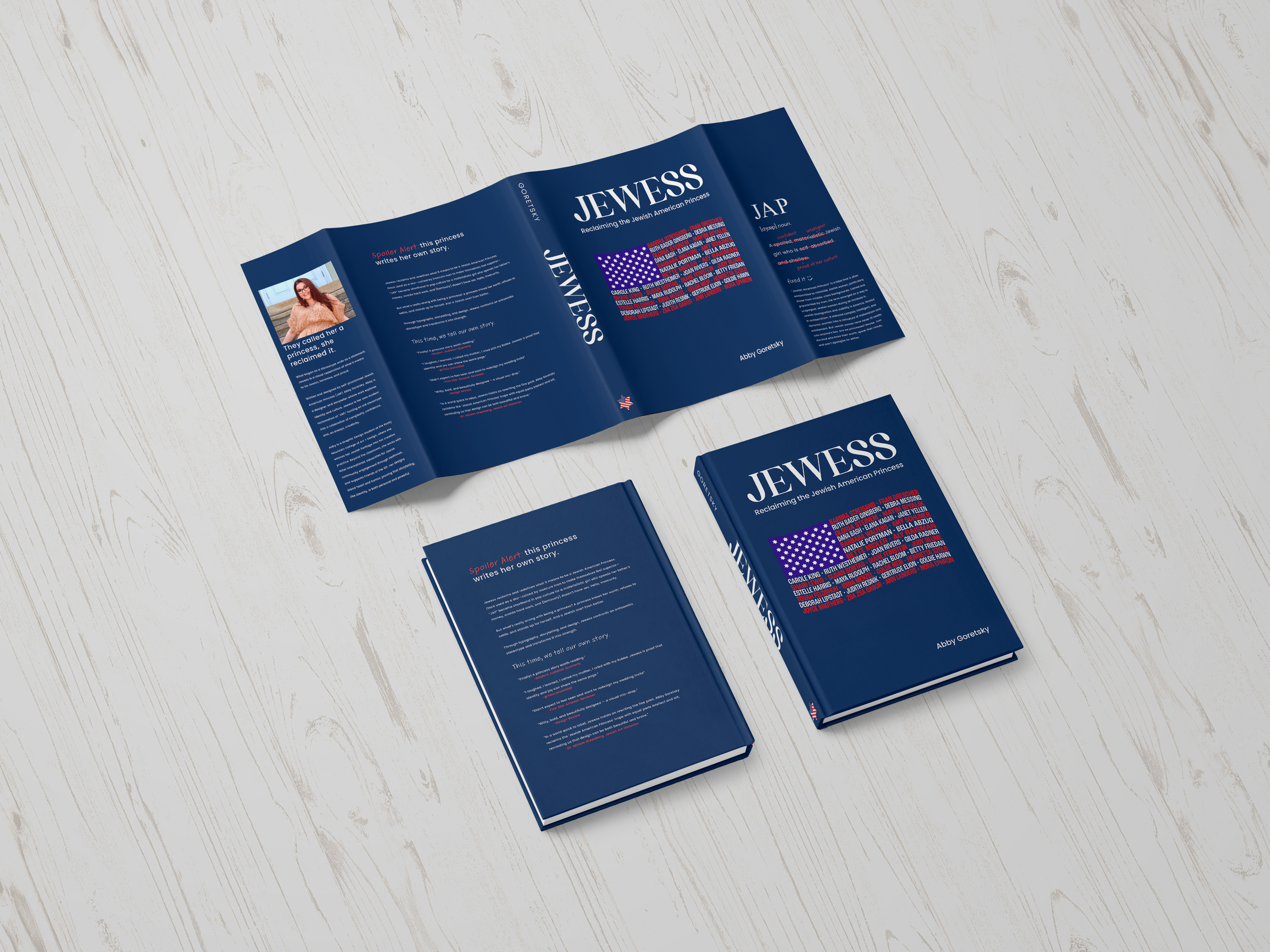
When building my portfolio, I knew Jewess deserved more. With my professor’s guidance, I expanded the original magazine cover into a full dust jacket, transforming a single-page design into a more complete visual story.
Revisiting the Project
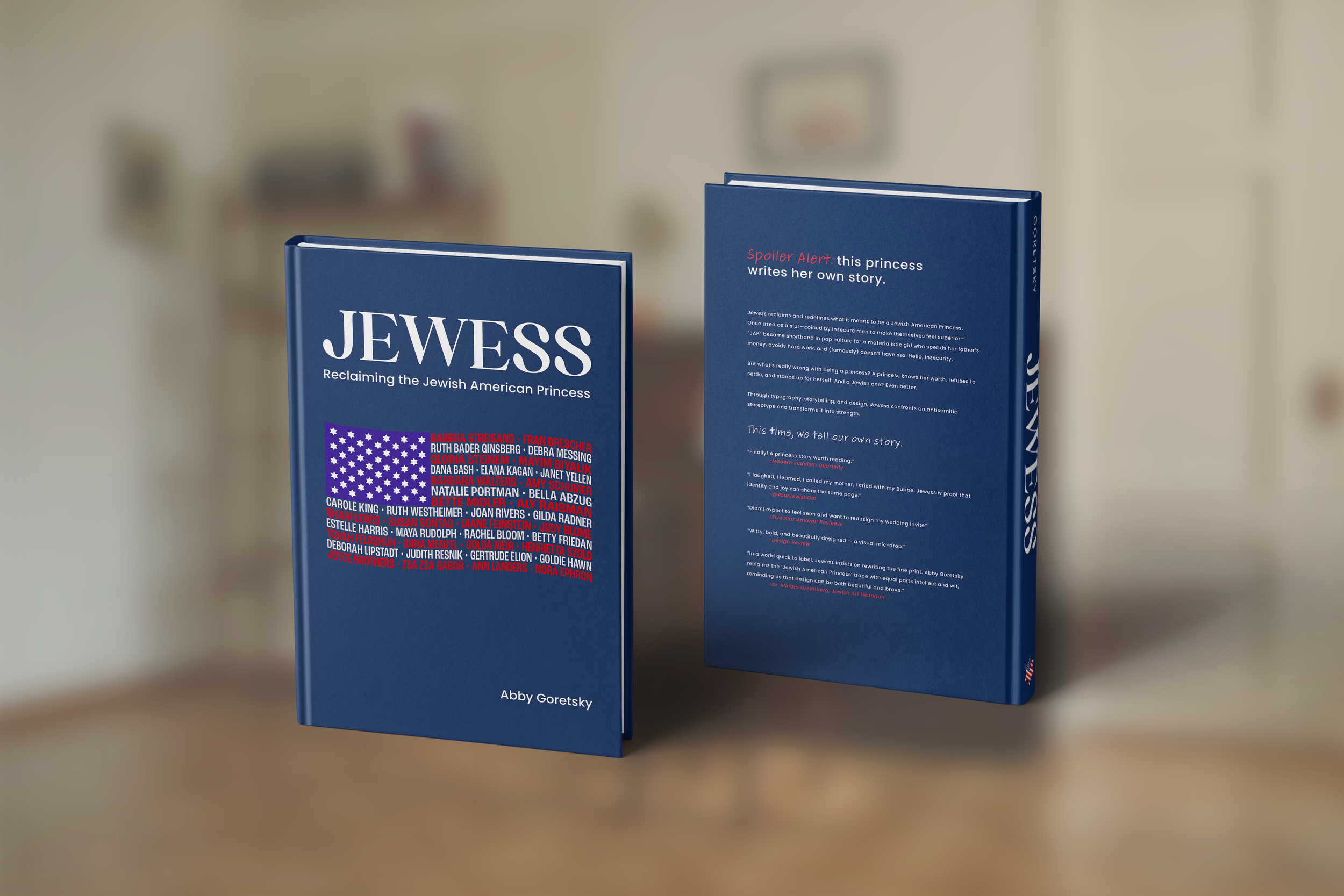
After some reflection, I lightened the background and refined the layout to better reflect a real book. This final version of Jewess became an act of reclamation—taking ownership of the term and transforming it into something empowering.
The New Final
I believe I achieved that intent by transforming a stereotype into something empowering and deeply personal. Expanding the project into a full dust jacket gave me room to tell a stronger visual story through typography, color, and tone. In the end, Jewess became more than just a design exercise, but also a reflection of my voice, my culture, and the power of reclaiming identity through art.
Intent