NOW ARRIVINGFact-Check
Gate
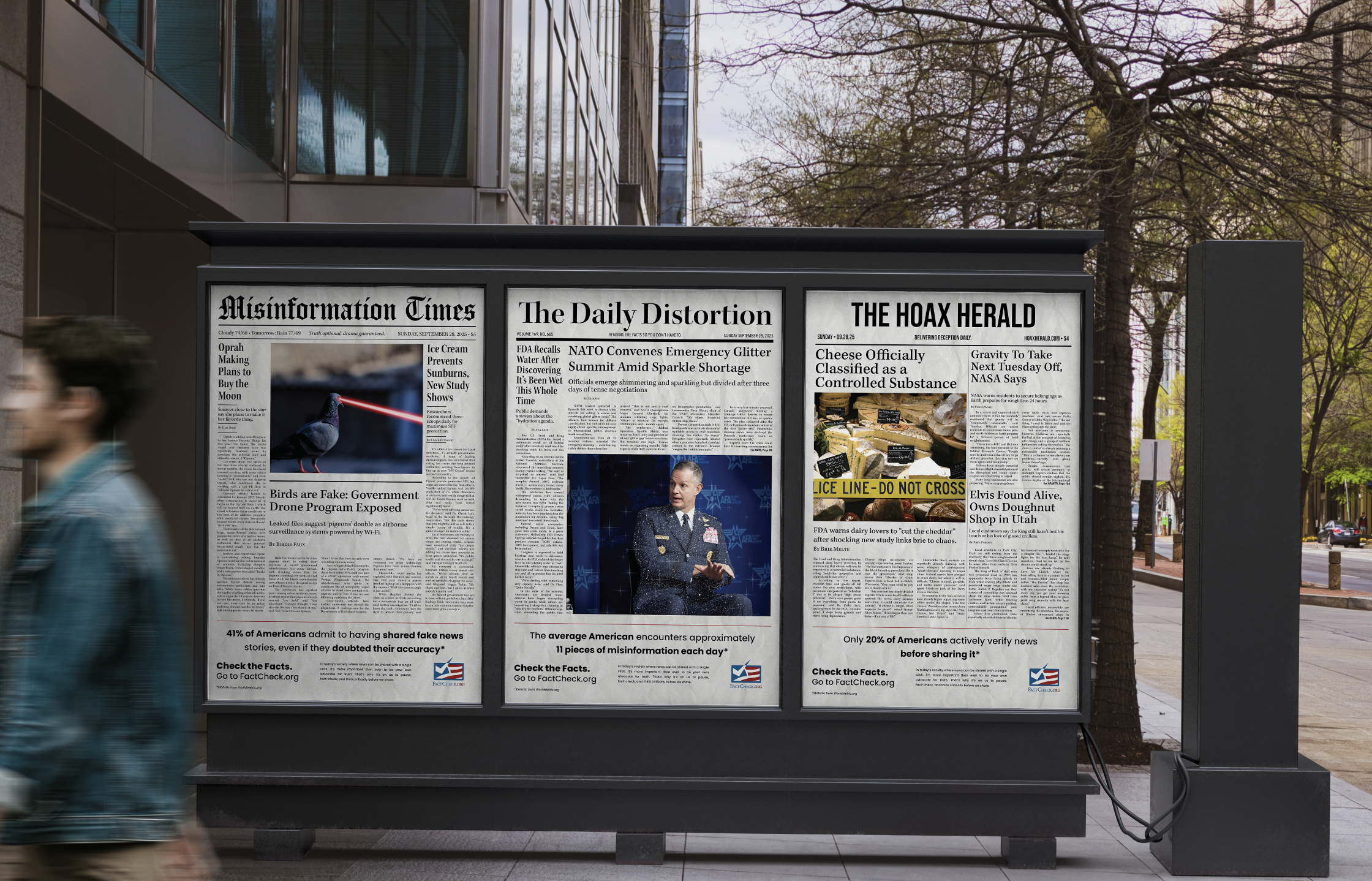
Portfolio Triptych
Flight Path
Perception, Satire, Truth
Year
2025
Fact-Check is a satirical exploration of misinformation and media influence, something that affects everyone in today’s information-saturated world. Through three fabricated newspapers, the project examines how layout, typography, and tone can make even the most absurd stories feel believable. It also highlights how easily misinformation spreads and how rarely it’s questioned. I wanted to use design as a tool to spark awareness, encouraging people to think critically, question their sources, and make fact-checking a daily habit.
I chose Kepler Std to echo traditional newspaper typography, creating familiarity and credibility within the fabricated layouts. Poppins balances this with a clean, modern contrast in footers and calls to action, reinforcing the project’s focus on fact-checking and media awareness.
Type Choice
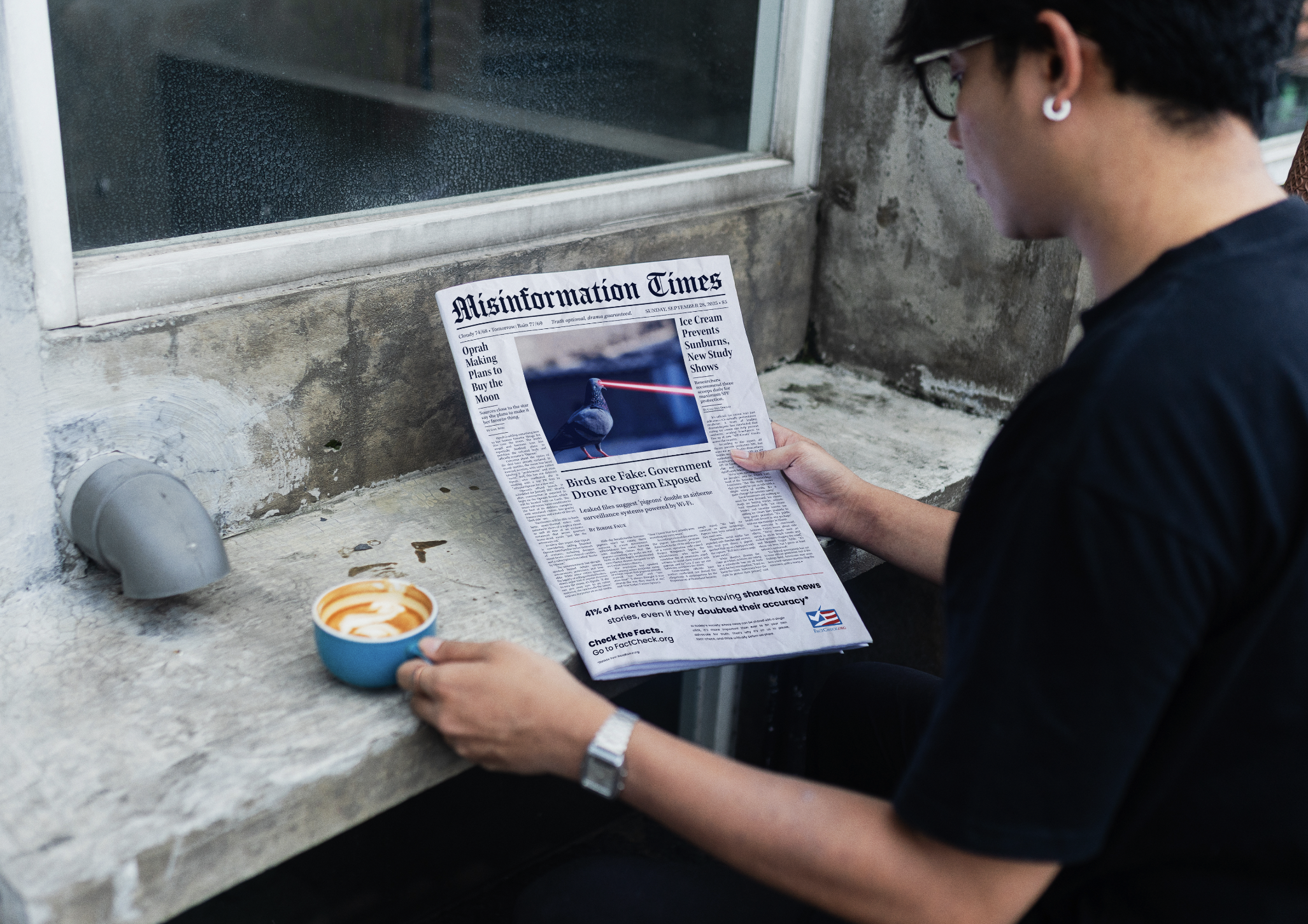
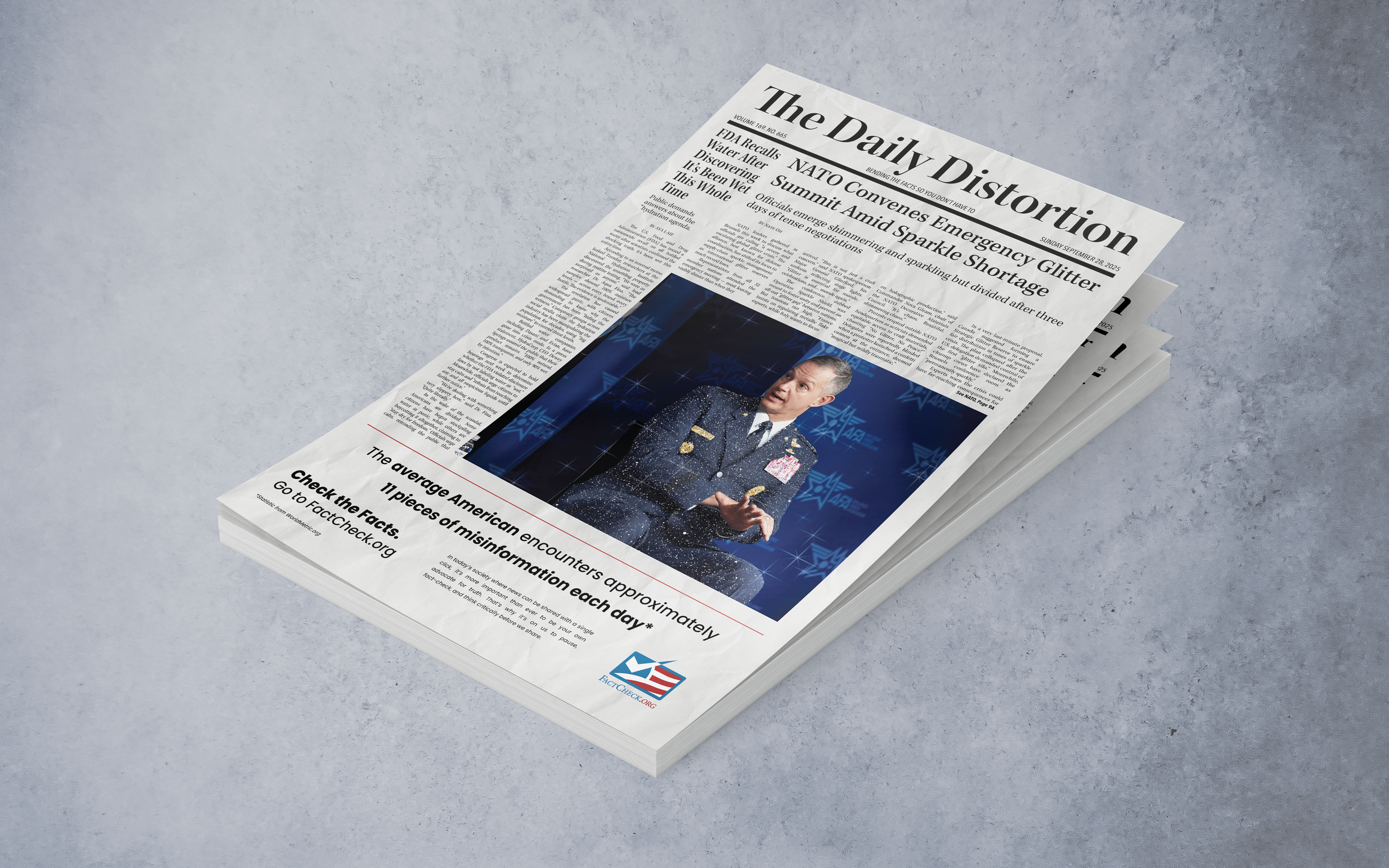
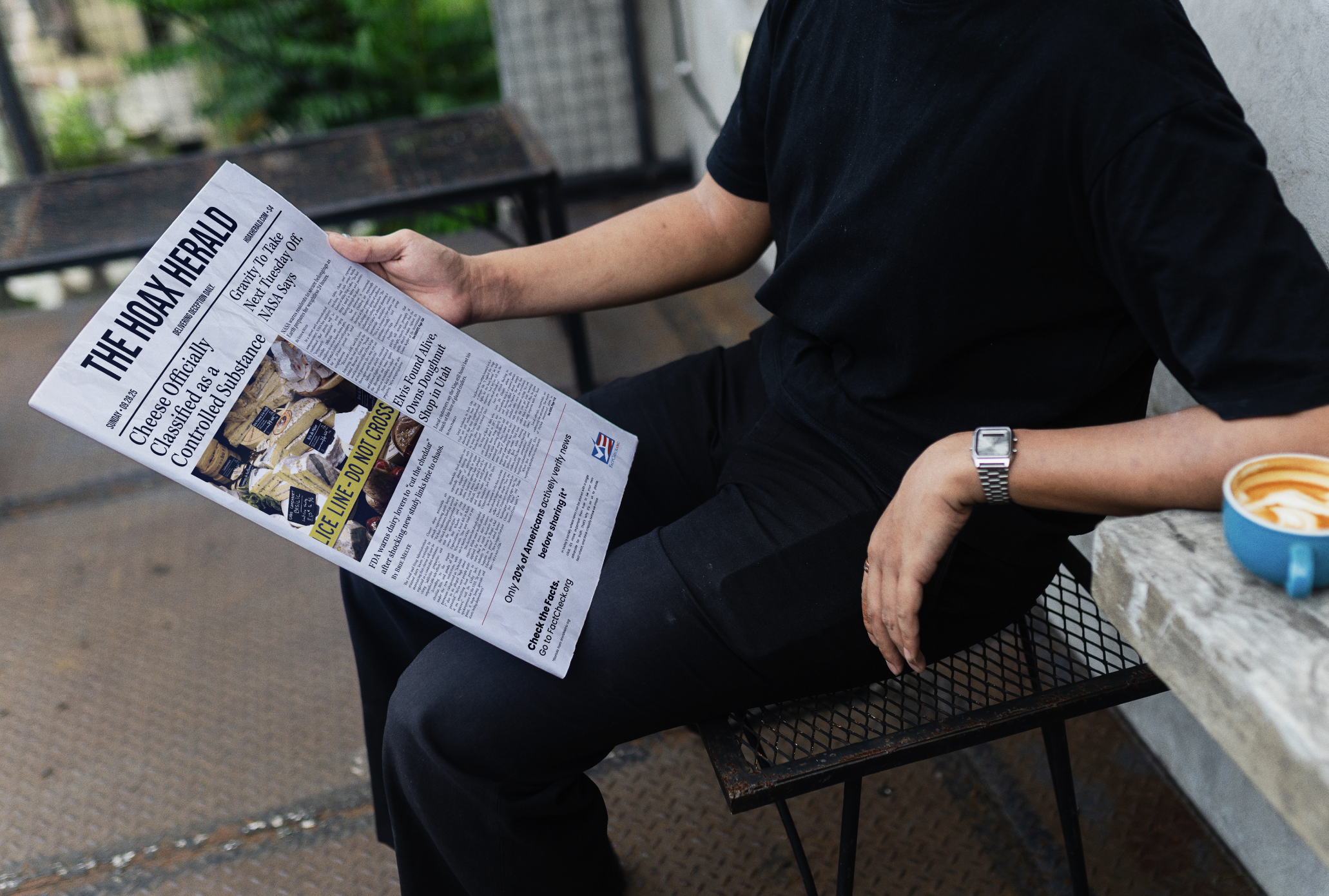
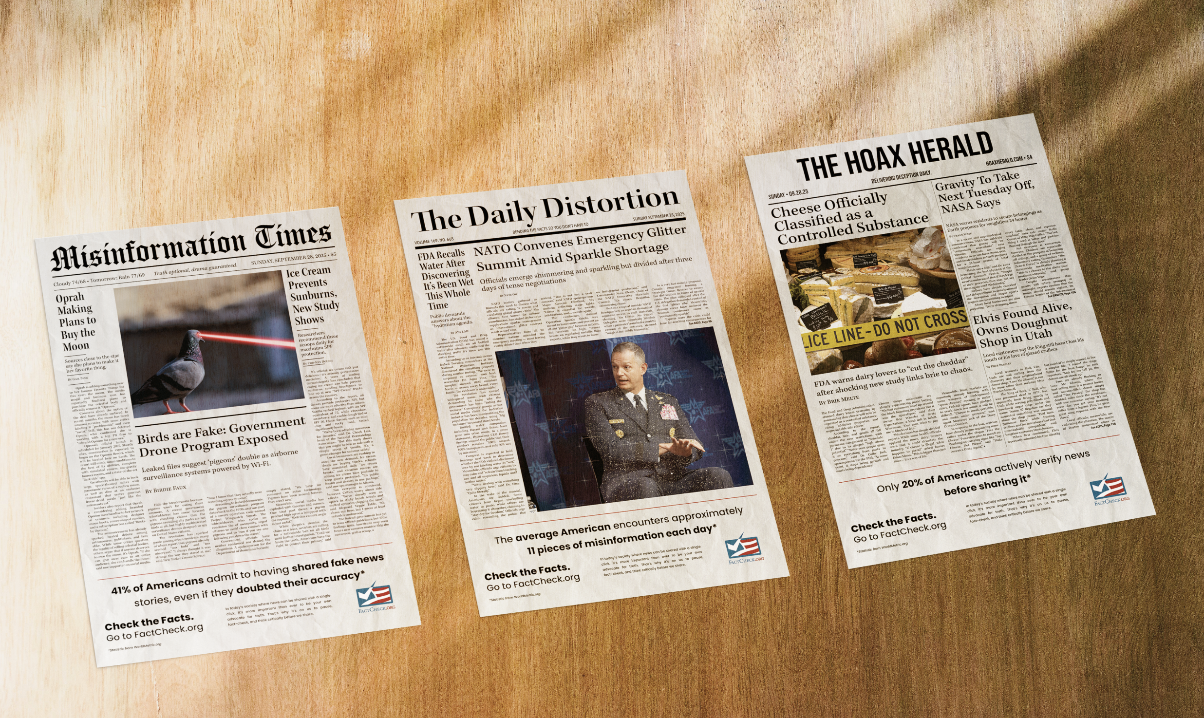
For my misinformation triptych, originally titled Check the Source, I created a campaign addressing bias in modern media. As news increasingly spreads through social platforms, especially among young adults, false information travels fast. This series urges viewers to slow down, question sources, fact-check, and look beyond the algorithm, with each piece visualizing misinformation in a different way
Concepts & Sketches
The first version mixed real and false newspaper stories to show how easily misinformation can look credible, with a call to action linking to FactCheck.org.
For the second version, I shifted to entirely misinformation-based stories to create a more cohesive series. I refined the layouts into three distinct newspapers, added subtle color, and included statistics to emphasize how widespread misinformation really is.
Digital Iterations
After a few more revisions, I updated the stories to better align across the series. I removed color to strengthen the realism and refined the footer for more visual weight, adding a newspaper texture to reinforce the idea that these could pass as legitimate publications.
Almost There
The final version brought everything together. I refined the footer and added spacing to clearly separate it from the misinformation content, making it feel intentional rather than ad-like. The series ultimately came together as a cohesive statement on how easily misinformation can blend into the everyday.
Perfecting the Details
I believe I achieved that intent by blending satire with realism to show just how convincing design can be. Every choice, from typography and texture to headline tone, was made to mimic the credibility of real news. By pushing viewers to pause and look closer, Fact-Check reinforces the idea that good design can inform, but it can also deceive, and that awareness is the first step toward media literacy.
Intent